library(tidyverse)Exploratory Data Analysis II
Fundamentals of Data Science for NHS using R
Today’s Plan
- Part 2: Exploratory Data Analysis
- Covariance
- Categorical and continuous variables
Refresher…
EDA will help you…
- Generate questions about your data.
- Search for answers by visualising, transforming, and modelling your data.
- Use what you learn to refine your questions and/or generate new questions.
- It’s an iterative cycle…
Making discoveries within your data
Two types of questions will always be useful for making discoveries within your data. You can loosely word these questions as:
- What type of variation occurs within my variables?
- What type of covariation occurs between my variables?
Covariation
- If variation describes the behavior within a variable, covariation describes the behavior between variables.
- Covariation is the tendency for the values of two or more variables to vary together in a related way.
Prerequisites
- We’ll combine what you’ve learned about
dplyrandggplot2to interactively ask questions, answer them with data, and then ask new questions.
Workshop Part 1: INTRODUCTION TO COVARIANCE
diamonds data
A dataset containing the prices and other attributes of almost 54,000 diamonds.
Visualising Categorical variable
What are the limitations of this plot?
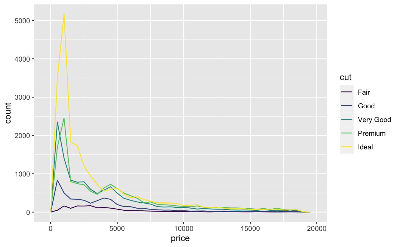
Visualising a Categorical variable
- It’s hard to see the difference in distribution because the overall counts differ so much.
- To make the comparison easier we need to swap what is displayed on the y-axis.
- Instead of displaying count, we’ll display density, which is the count standardised so that the area under each frequency polygon is one.
Density
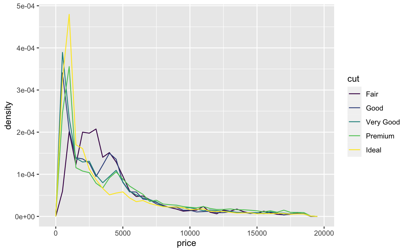
Visualising a Categorical variable
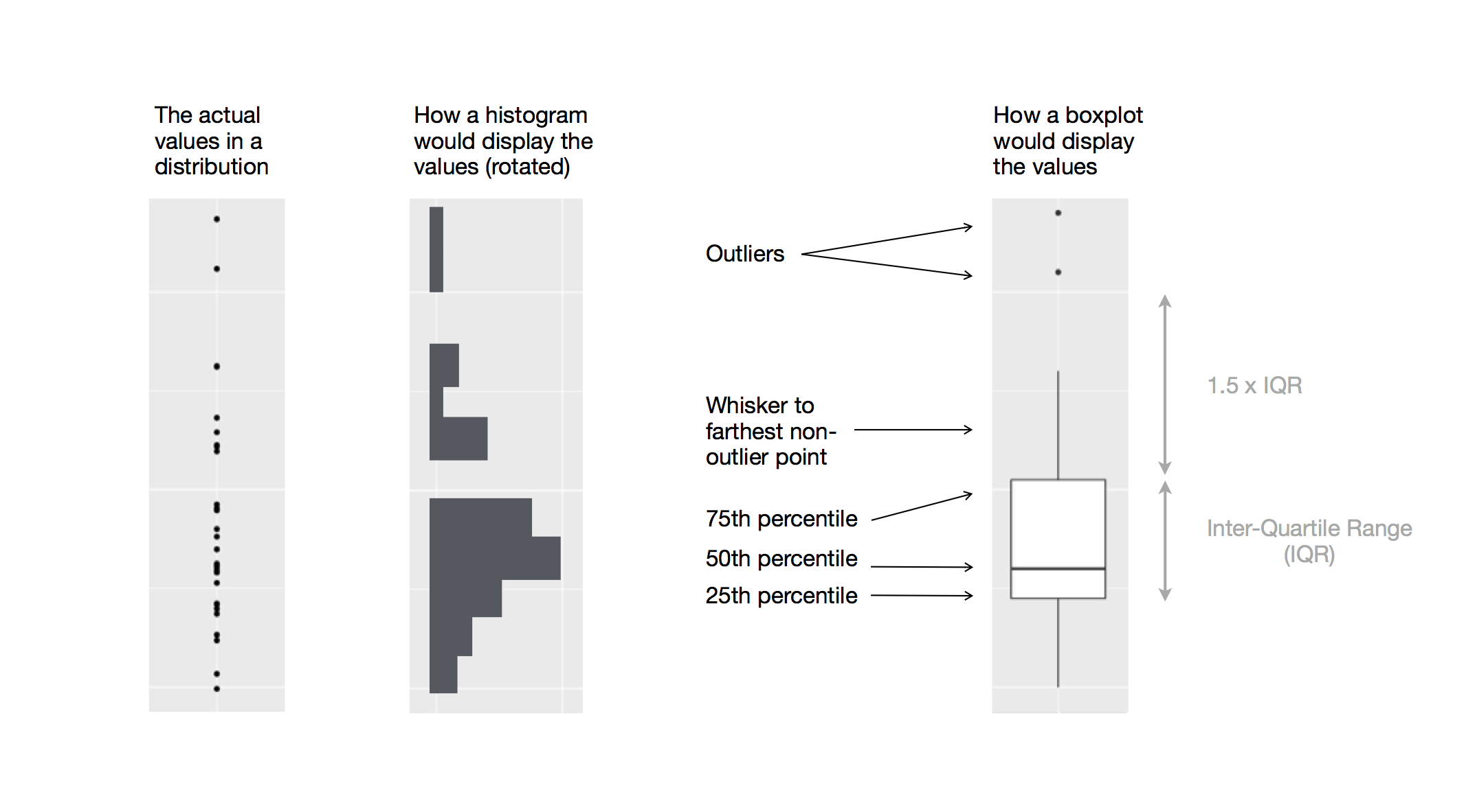
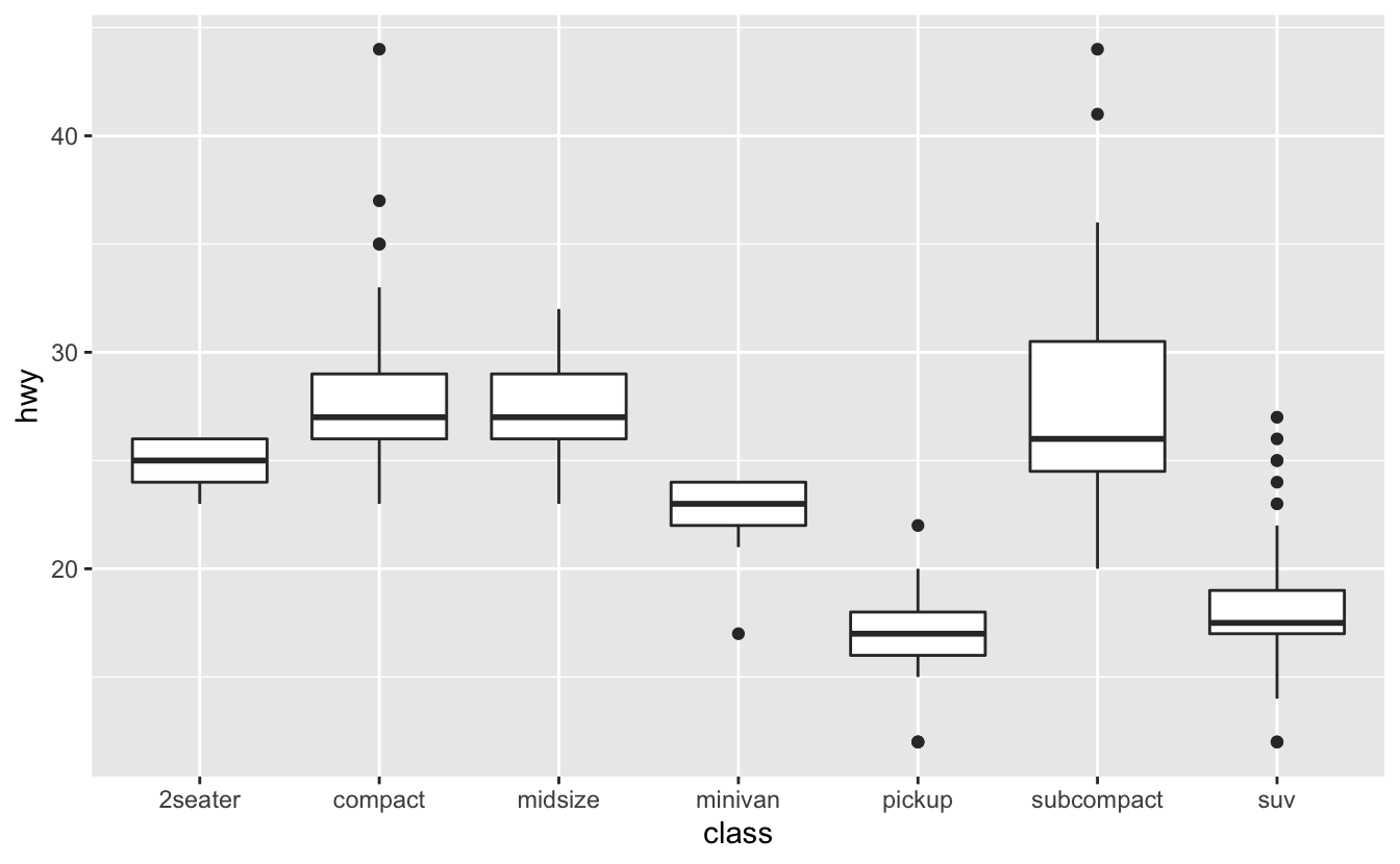
Each Boxplot consists of:
- A box that stretches from the 25th percentile of the distribution to the 75th percentile, a distance known as the interquartile range (IQR).
- In the middle of the box is a line that displays the median, i.e. 50th percentile, of the distribution.
- Visual points that display observations that fall more than 1.5 times the IQR from either edge of the box.
- A line (or whisker) that extends from each end of the box and goes to the farthest non-outlier point in the distribution.
Interpreting a Boxplot
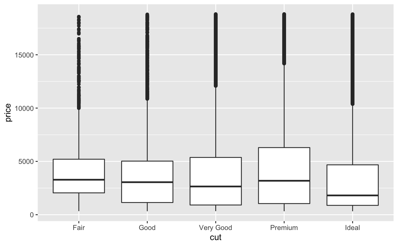
EXERCISE
- What is the boxplot telling us about the relationship with cut and price?
- What does it tell us about the variation in price for each type of cut?
- What are the limitations of the plot?
EXERCISE
- What variable in the diamonds dataset is most important for predicting the price of a diamond?
- How is that variable correlated with cut?
mpg dataset
Fuel economy data from 1999 to 2008 for 38 popular models of cars.
EXERCISE
- Investigate the
mpgdataset. - What relationship exists between highway mileage (
hwy) andclass? - How could the visualisation be improved?
EXERCISE
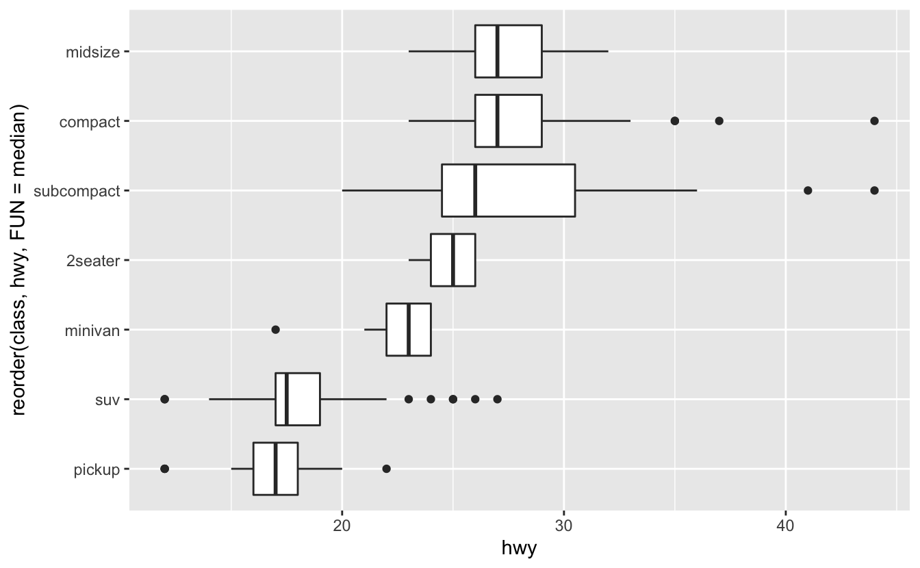
Reorder function
We can reorder the class using the reorder function. FUN = numeric summary function.
Interpreting a Boxplot
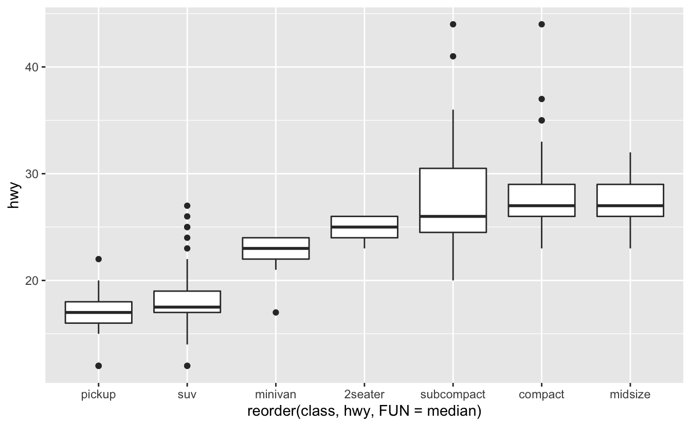
Reorder function
If you have long variable names, geom_boxplot() will work better if you flip it 90 degrees. You can do that with coord_flip().
Interpreting a Boxplot
Two Categorcial variables
- To visualise the covariation between categorical variables, you’ll need to count the number of observations for each combination.
- The size of each circle in the plot displays how many observations occurred at each combination of values.
- Covariation will appear as a strong correlation between specific x values and specific y values.
geom_count
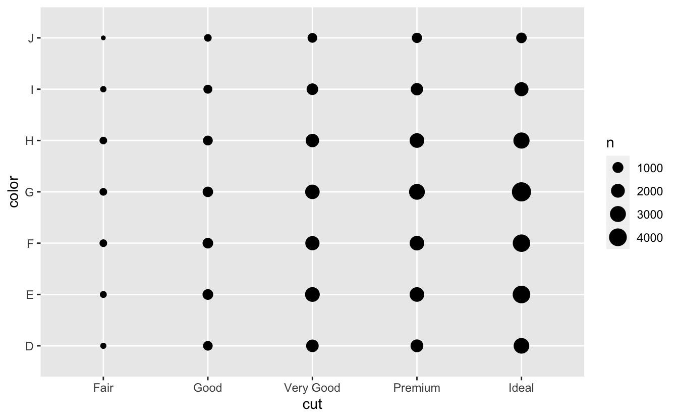
EXERCISE
- How could you rescale the count dataset above to more clearly show the distribution of cut within colour, or colour within cut?
- Why is it slightly better to use
aes(x = color, y = cut)rather thanaes(x = cut, y = color)in the example above?
Two Continuous variables
You’ve already seen one great way to visualise the covariation between two continuous variables: draw a scatterplot with geom_point().
Relationship between carat and price
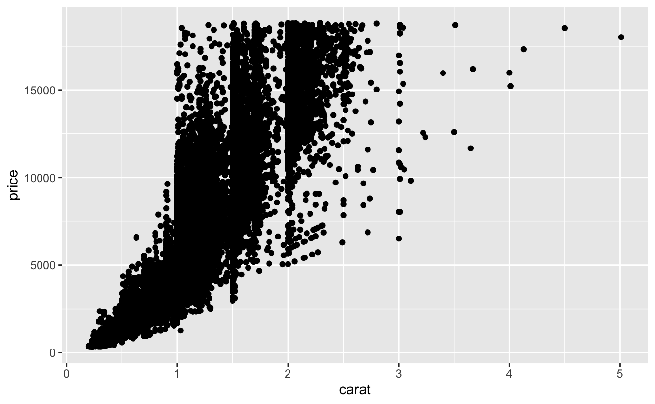
Disadvantages of Scatterplots?
Scatterplots become less useful as the size of your dataset grows, because points begin to overplot, and pile up into areas of uniform black.
Add transparency
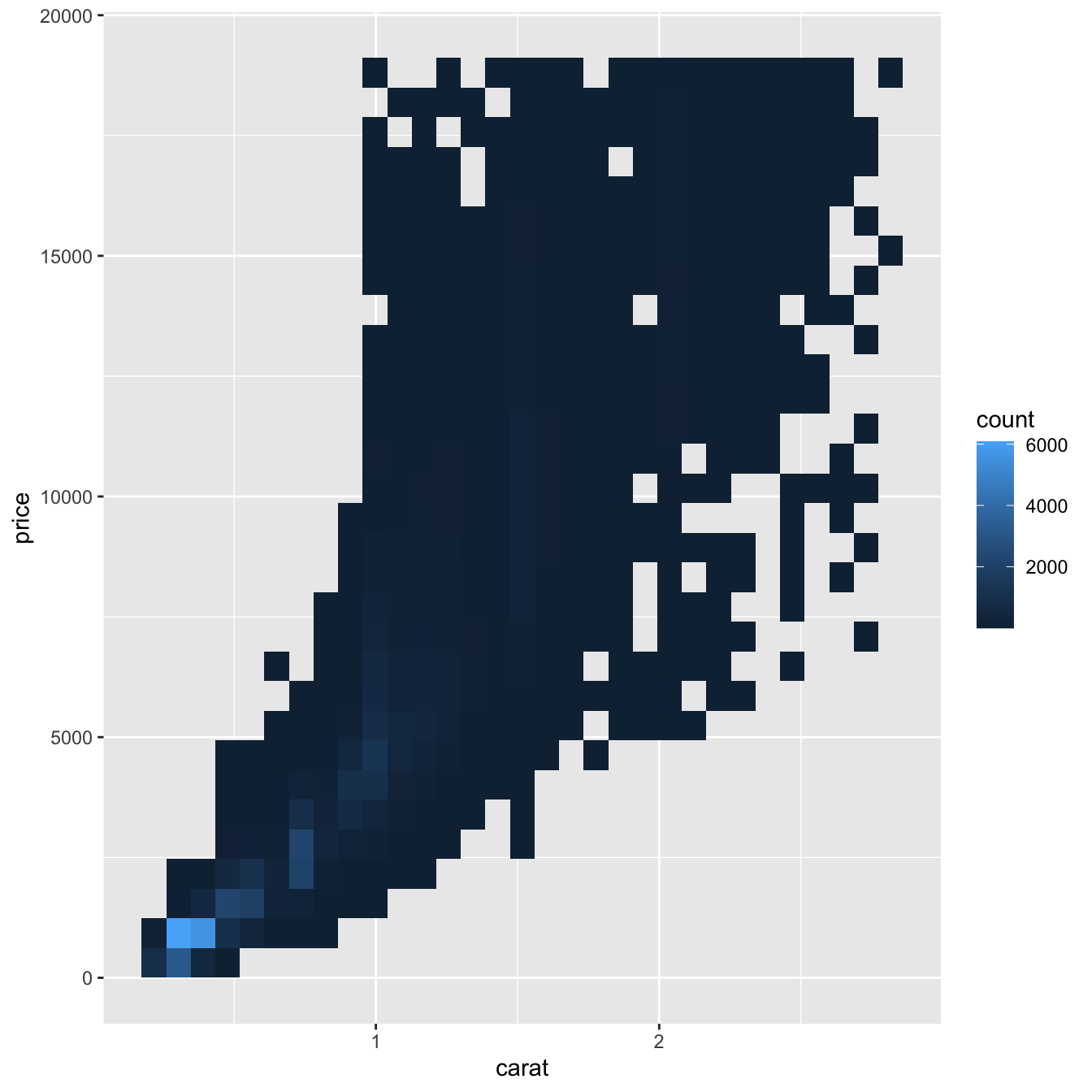
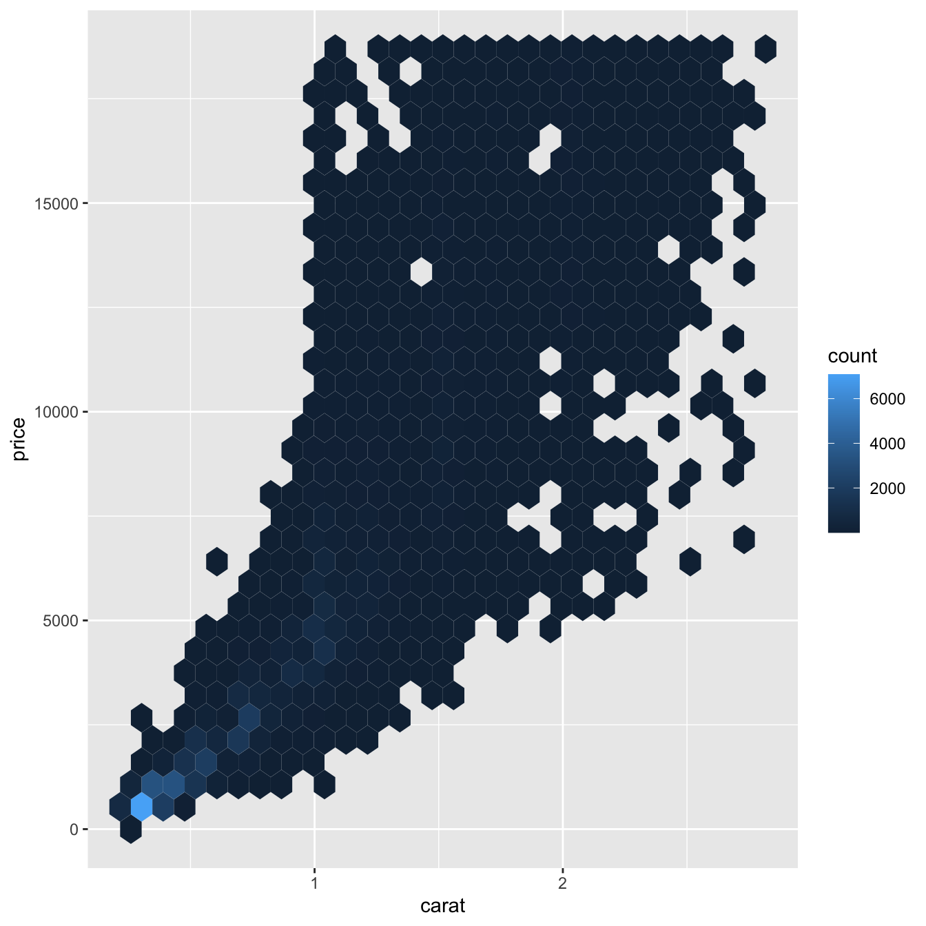
Binning
geom_bin2d() and geom_hex() divide the coordinate plane into 2d bins and then use a fill color to display how many points fall into each bin.
geom_bin2d()creates rectangular binsgeom_hex()creates hexagonal bins
Binning
Binning Continuous variable
- Another option is to bin one continuous variable so it acts like a categorical variable.
- Then you can use one of the techniques for visualising the combination of a categorical and a continuous variable that you learned about.
Boxplot options
- By default, boxplots look roughly the same regardless of how many observations there are.
- One way to show that is to make the width of the boxplot proportional to the number of points with
varwidth = TRUE. - Another approach is to display approximately the same number of points in each bin.
EXERCISES
Instead of summarising the conditional distribution with a boxplot, you could use a frequency polygon.
What do you need to consider when using cut_width() vs cut_number()? How does that impact a visualisation of the 2d distribution of carat and price?
EXERCISES
- Visualise the distribution of carat, partitioned by price.
- How does the price distribution of very large diamonds compare to small diamonds? Is it as you expect, or does it surprise you?
- Combine two of the techniques you’ve learned to visualise the combined distribution of cut, carat, and price.
Patterns and models
Patterns in your data provide clues about relationships. If you spot a pattern, ask yourself:
- Could this pattern be due to coincidence?
- How can you describe the relationship?
- How strong is the relationship implied by the pattern?
- What other variables might affect the relationship?
- Does the relationship change if you look at subgroups?
nycflights13
On-time data for all flights that departed NYC (i.e. JFK, LGA or EWR) in 2013.
nycflights13

EXERCISES
- Use what you’ve learned to improve the visualisation of the departure times of cancelled vs. non-cancelled flights.
- Use geom_tile() together with dplyr to explore how average flight delays vary by destination and month of year.
- What makes the plot difficult to read? How could you improve it?