library(tidyverse)Exploratory Data Analysis I
Fundamentals of Data Science for NHS using R
Today’s Plan
- Introduction to exploratory data analysis
- Distributions
- Variance
- Missing values
Let’s start at the beginning…
EDA will help you…
- Generate questions about your data.
- Search for answers by visualising, transforming, and modelling your data.
- Use what you learn to refine your questions and/or generate new questions.
- It’s an iterative cycle…
Why is EDA so important?
You always need to investigate the quality of your data.
- EDA is not a formal process with a strict set of rules.
- As your exploration continues, you will home in on a few particularly productive areas that you’ll eventually write up and communicate to others.
Important definitions
- A
variableis a quantity, quality, or property that you can measure. - A
valueis the state of a variable when you measure it and may change from measurement to measurement. - An
observationis a set of measurements made under similar conditions; contains several values. Tabular datais a set of values, each associated with a variable and an observation. Tabular data is tidy if each value is placed in its own “cell”, each variable in its own column, and each observation in its own row.
Prerequisites
- We’ll combine what you’ve learned about
dplyrandggplot2to interactively ask questions, answer them with data, and then ask new questions.
Making discoveries within your data
Two types of questions will always be useful for making discoveries within your data. You can loosely word these questions as:
- What type of variation occurs within my variables?
- What type of covariation occurs between my variables?
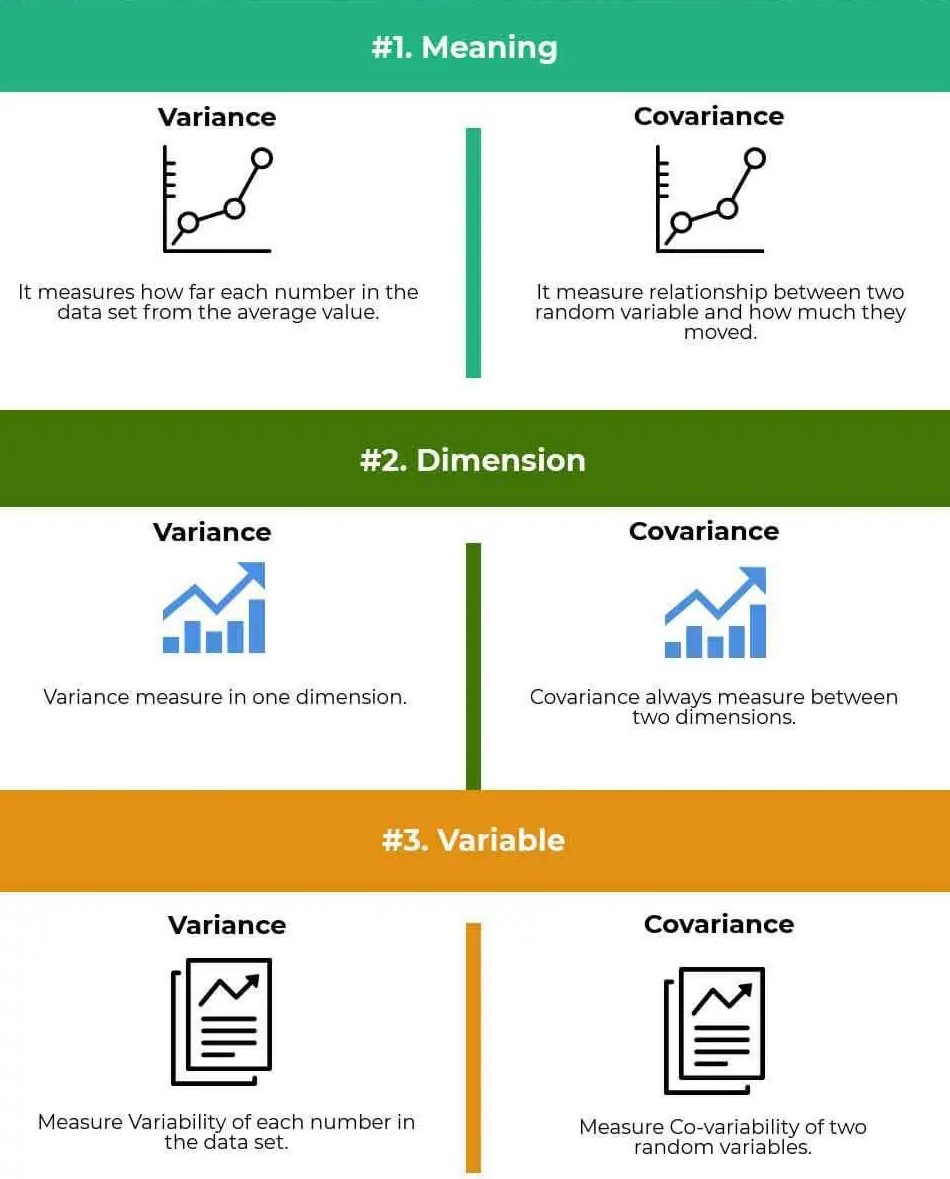
Variance v’s Covariance
The importance of Visualisation
- Summary statistics indeed help us understand the data but will never reveal everything of it.
- Relying solely on summary statistics such as mean, variance and correlation, can make you miss the bigger picture.
Workshop Part 1: INTRODUCTION TO VARIANCE
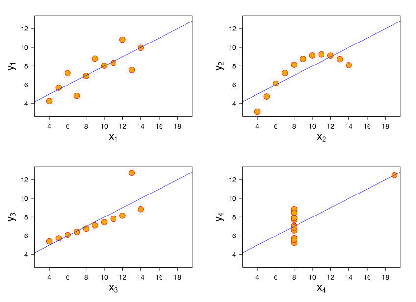
Anscombe's quartetcomprises four data sets. Each dataset consists of eleven (x,y) points.- When analsyed they have nearly identical simple descriptive statistics, yet have very different distributions and appear very different when graphed.
Anscombe’s Quartet
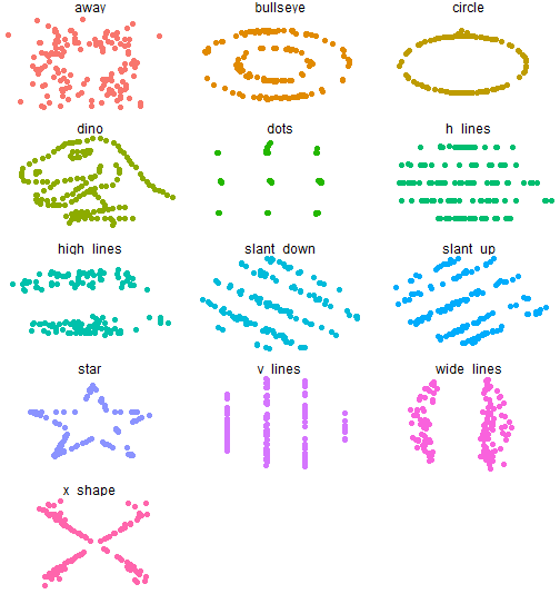
DatasauRus
- The
Datasaurusdataset was initially created by Alberto Cairo. It is composed of 142 observations with a bivariate normal distribution. - Inspired by this example, two researchers at Autodesk Research, Justin Matejka and George Fitzmaurice, created another twelve similar datasets.
DatasauRus Plots
Workshop Part 2: INTRODUCTION TO EDA
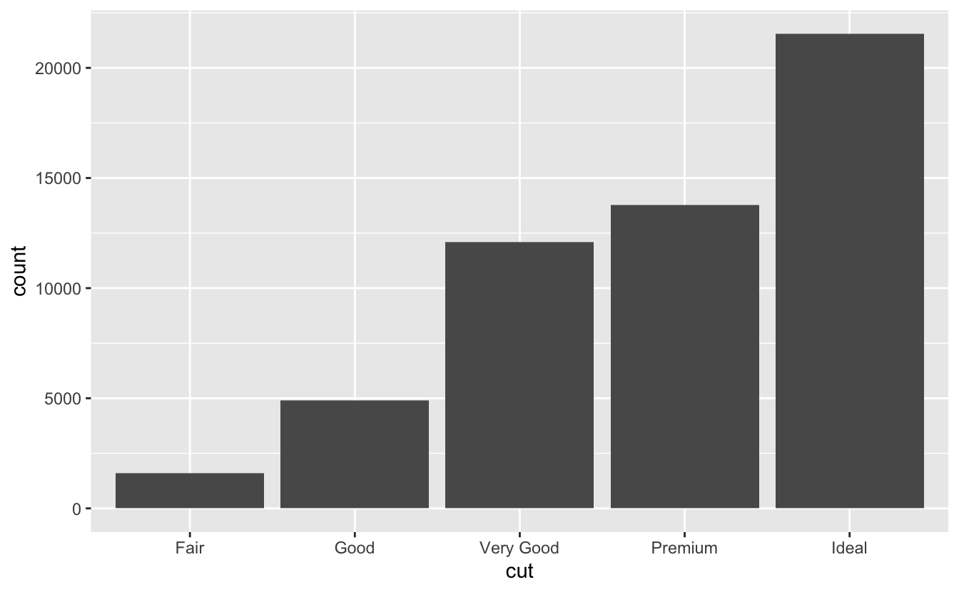
diamonds data
A dataset containing the prices and other attributes of almost 54,000 diamonds.
Visualising distributions
Every variable has its own pattern of variation, which can reveal interesting information. The best way to understand that pattern is to visualise the distribution of the variable’s values. To examine the distribution of a categorical variable, use a bar chart.
Distribution of a categorical variable
Visualising distributions
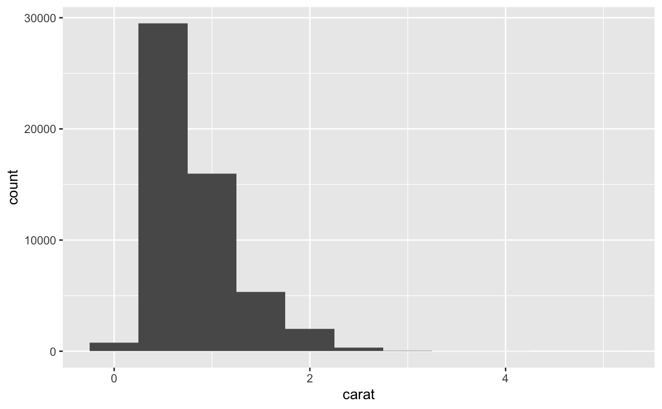
To examine the distribution of a continuous variable, use a histogram:
Distribution of a continuous variable
EXERCISE
- What should you look for in your plots?
- What follow up questions should you ask?
EXERCISE
- Which values are the most common? Why?
- Which values are rare? Why? Does that match your expectations?
- Can you see any unusual patterns? What might explain them?
EXERCISE
EXERCISE
What is the histogram telling us?
- Why are there more diamonds at whole carats and common fractions of carats?
- Why are there more diamonds slightly to the right of each peak than there are slightly to the left of each peak?
- Why are there no diamonds bigger than 3 carats?
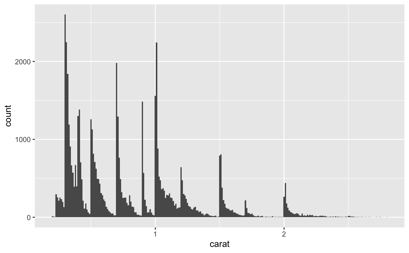
Clusters of similar values
Clusters of similar values suggest that subgroups exist in your data. To understand the subgroups, ask:
- How are the observations within each cluster similar to each other?
- How are the observations in separate clusters different from each other?
- How can you explain or describe the clusters?
- Why might the appearance of clusters be misleading?
Unusual values
Outliers are observations that are unusual; data points that don’t seem to fit the pattern. Sometimes outliers are data entry errors; other times outliers suggest important new science.

EXERCISE
- Explore the distribution of each of the x, y, and z variables in diamonds. What do you learn? Think about a diamond and how you might decide which dimension is the length, width, and depth.
- Explore the distribution of price. Do you discover anything unusual or surprising?
- How many diamonds are 0.99 carat? How many are 1 carat? What do you think is the cause of the difference?
Closer inspection
- The
yvariable measures one of the three dimensions of these diamonds, in mm. - We know that diamonds can’t have a width of 0mm, so these values must be incorrect.
- We might also suspect that measurements of 32mm and 59mm are implausible: those diamonds are over an inch long, but don’t cost hundreds of thousands of dollars!
Closer inspection
- It’s good practice to repeat your analysis with and without the outliers.
- If they have minimal effect on the results, and you can’t figure out why they’re there, it’s reasonable to replace them with missing values, and move on.
- If they have a substantial effect on your results, you shouldn’t drop them without justification. You’ll need to figure out what caused them (e.g. a data entry error) and disclose that you removed them in your write-up.
Missing values
If you’ve encountered unusual values in your dataset, and simply want to move on to the rest of your analysis, you have two options.
- Drop the entire row with the strange values
- Replacing the unusual values with missing values
Drop entire row
- I don’t recommend this option because just because one measurement is invalid, doesn’t mean all the measurements are.
- Additionally, if you have low quality data, by time that you’ve applied this approach to every variable you might find that you don’t have any data left!
Replacing values
- Instead, I recommend replacing the unusual values with missing values.
- The easiest way to do this is to use mutate() to replace the variable with a modified copy.
- You can use the ifelse() function to replace unusual values with NA.
What makes observations missing?
Other times you want to understand what makes observations with missing values different to observations with recorded values.
- What happens to missing values in a histogram? What happens to missing values in a bar chart? Why is there a difference?
- What does na.rm = TRUE do in mean() and sum()?
nycflights13
On-time data for all flights that departed NYC (i.e. JFK, LGA or EWR) in 2013.
nycflights13
For example, in nycflights13::flights, missing values in the dep_time variable indicate that the flight was cancelled?
- So you might want to compare the scheduled departure times for cancelled and non-cancelled times.
- You can do this by making a new variable with is.na().
nycflights13

Thank you!
In the next episode
EDA Part 2