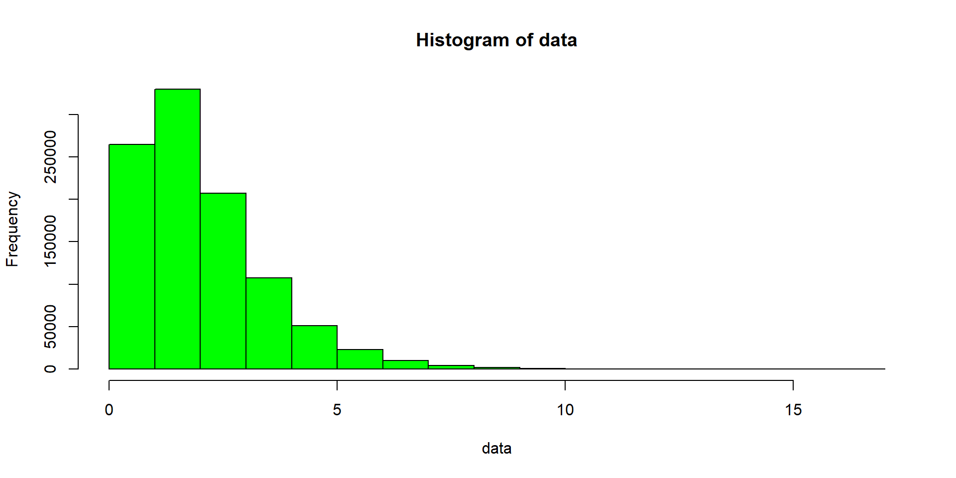
hist(data, col = "green") # data is a vectorData Visualisation I
Fundamentals of Data Science for NHS using R
Data Visualisation in baseR
Data Visualisation in ggplot2
data |> # data is a tibble
    ggplot(mapping = aes(x = x)) + geom_histogram(fill = "green", col = "black") +
    labs(title = "Histogram of data") + theme_minimal(base_size = 16)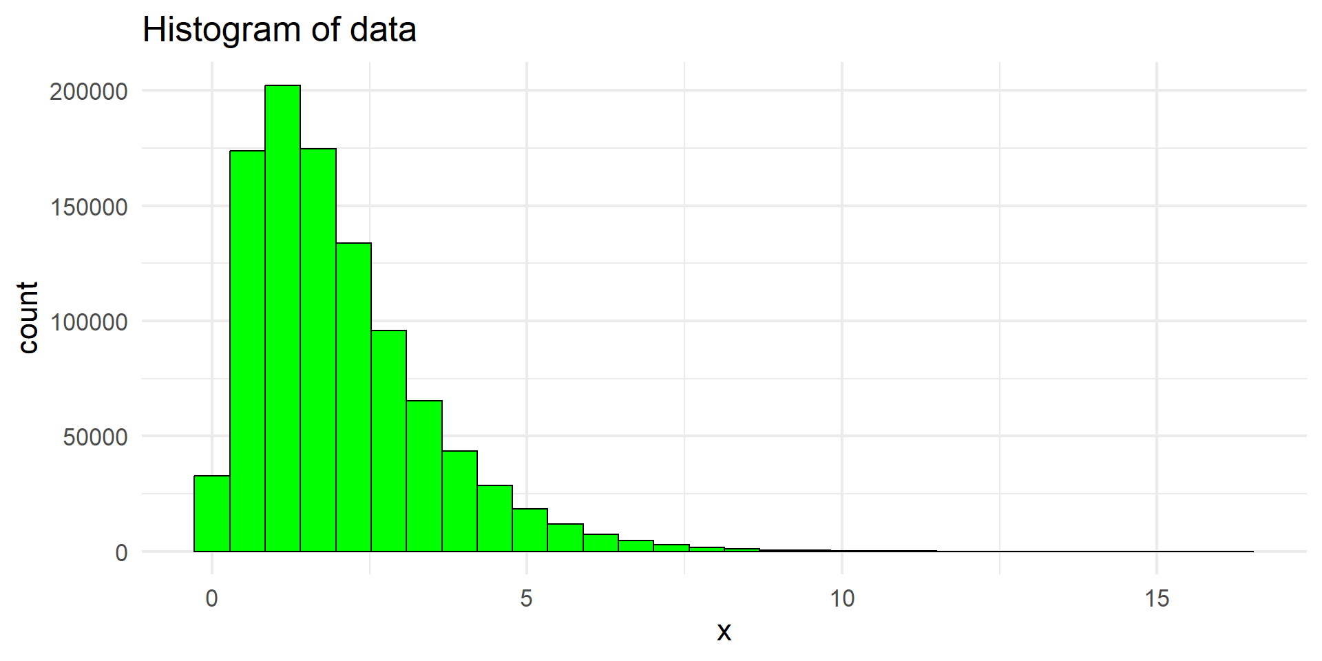
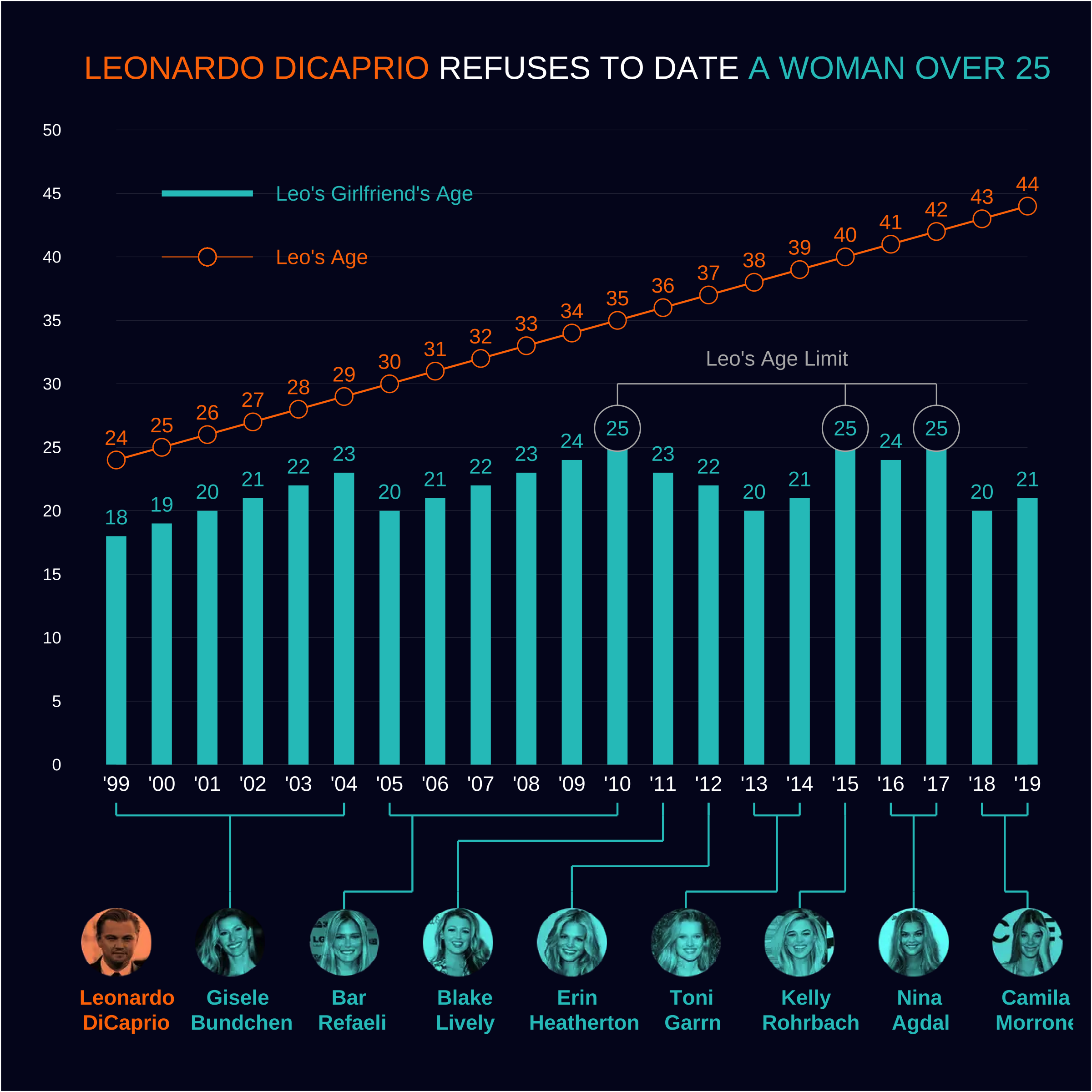
The Leo Chart
The Grammar of Graphics book
Theoretical foundation of graphical applications and packages including ggplot2.
Should you read it? Maybe in the future!
To have an intuition (and other things about ggplot2) watch
R for Data Science
R for Data Science work-in-progress 2nd edition by Hadley Wickham, Mine Çetinkaya-Rundel, Garrett Grolemund.
This is still the best place where to start also for data visualisation! (see chapters 2 and 10)
R Graphics Cookbook
R Graphics Cookbook (2e) by Winston Chang.
A lot of recipes to produce plots!
ggplot2 book
ggplot2 (3e) by Hadley Wickham & Danielle Navarro & Thomas Lin Pedersen.
This is what you should read to fully understand how ggplot2 works.
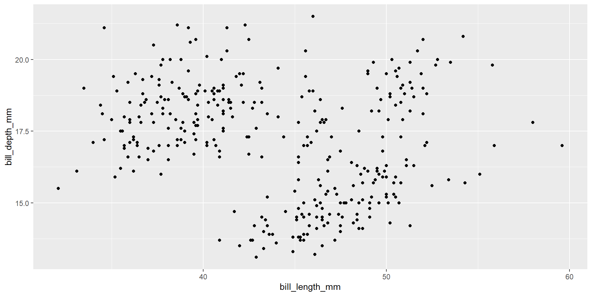
Exercise 2
Draw a scatter plot using the variable bill_length_mm for the x-axis, and the variable bill_depth_mm on the y-axis.
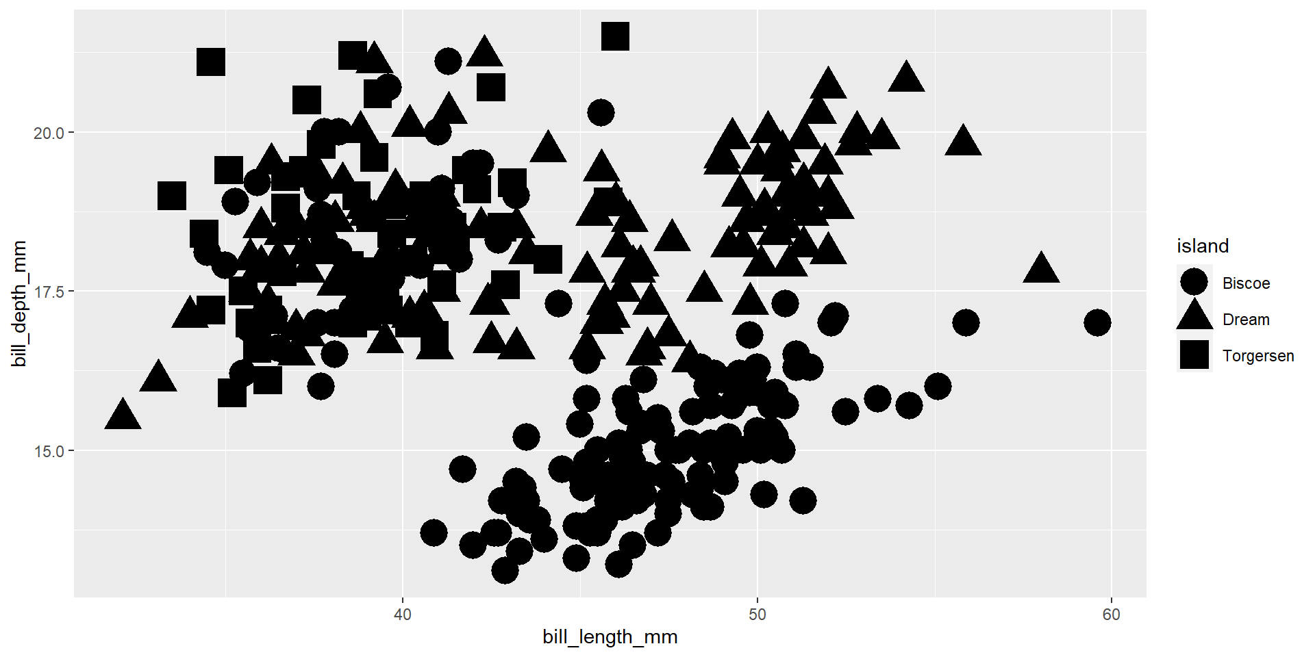
Exercise 3
Draw a scatter plot using the variable bill_length_mm for the x-axis, and the variable bill_depth_mm on the y-axis. Use different shapes for different islands.

Exercise 4
Draw a scatter plot using the variable bill_length_mm for the x-axis, and the variable bill_depth_mm on the y-axis. Use different shapes for different islands. Increase the size of the points to 7. We will keep this size for the rest of the session unless otherwise stated.
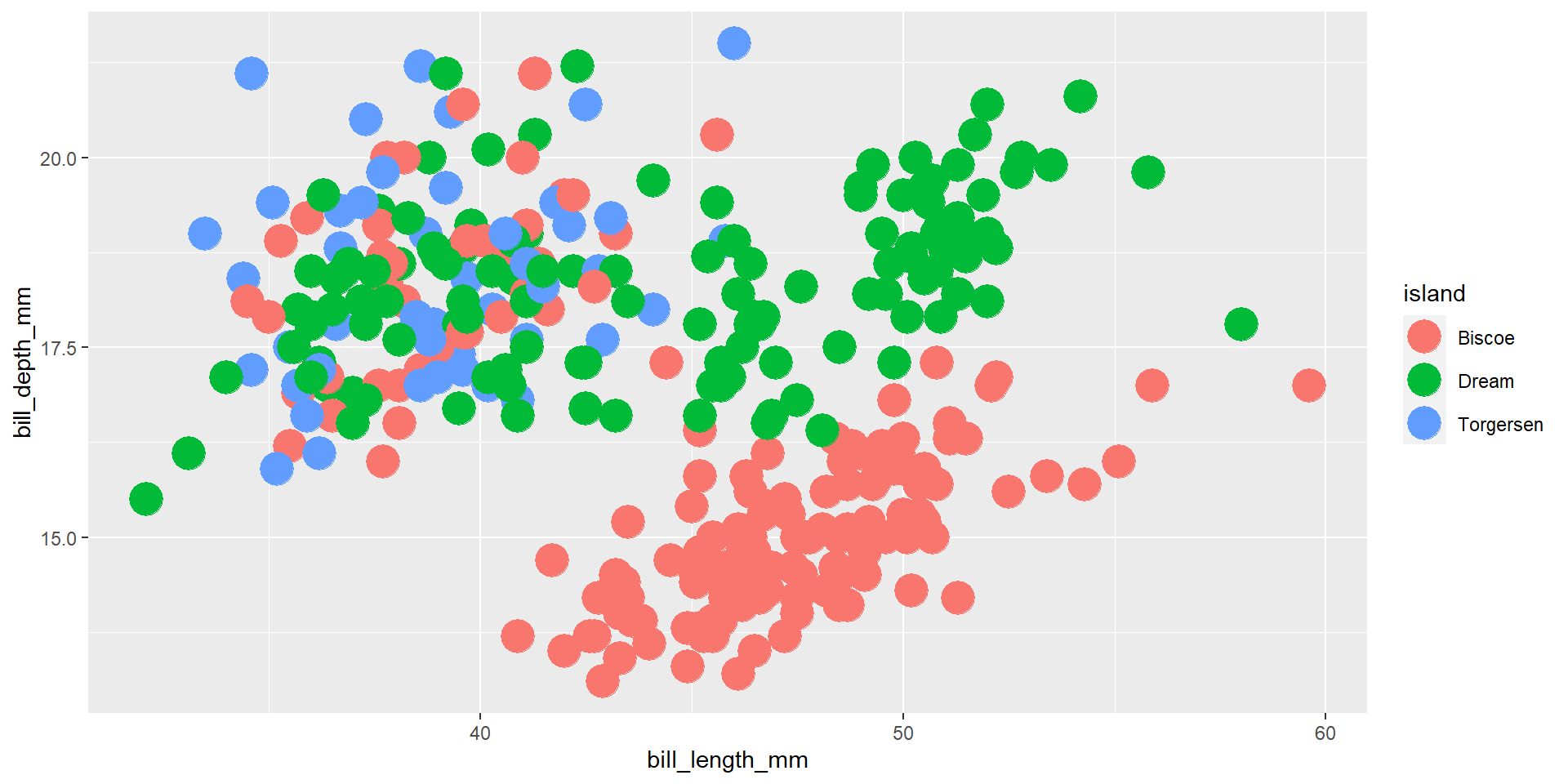
Exercise 5
Draw a scatter plot using the variable bill_length_mm for the x-axis, and the variable bill_depth_mm on the y-axis. Use different colours for different islands.
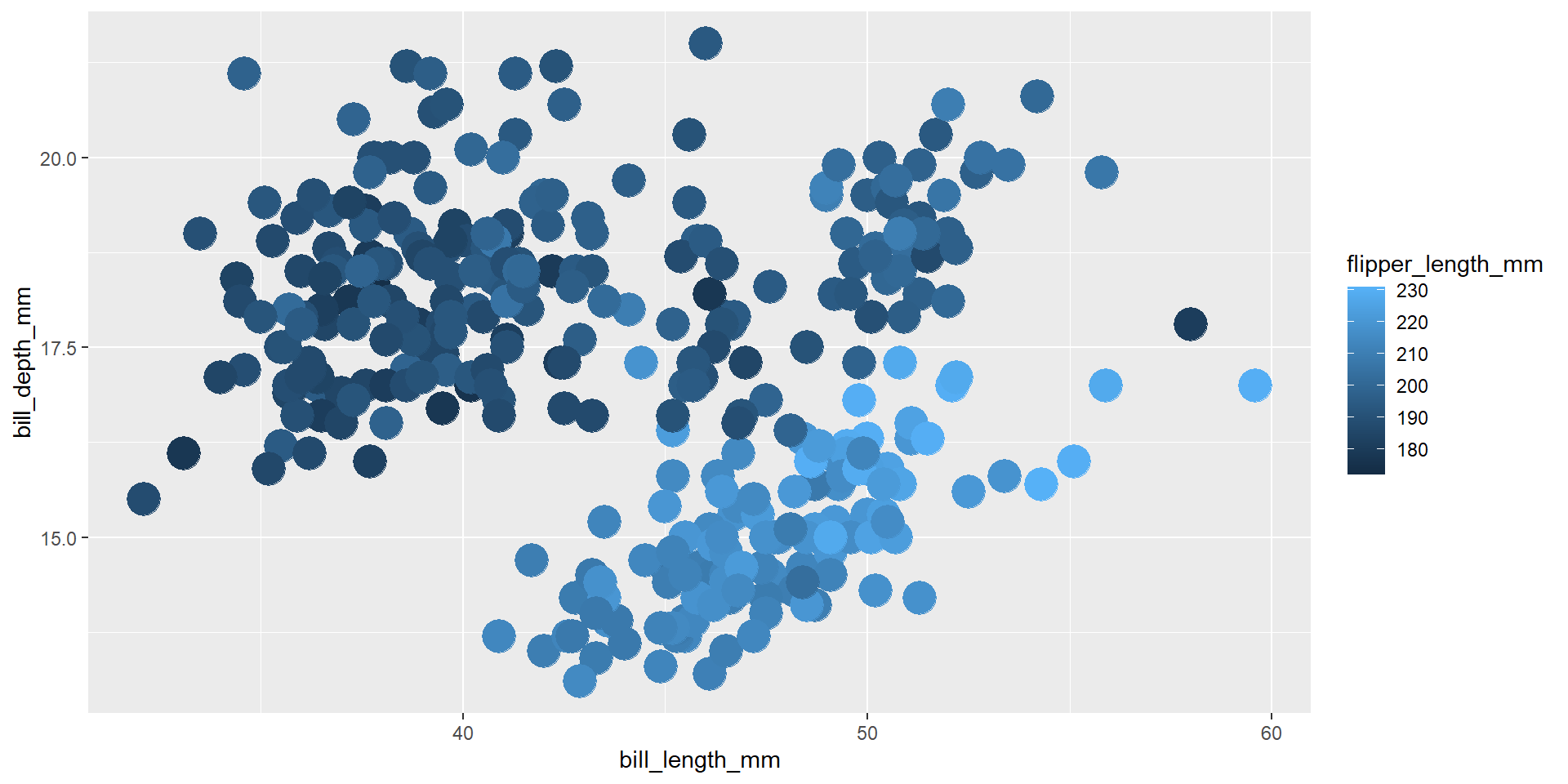
Exercise 6
Draw a scatter plot using the variable bill_length_mm for the x-axis, and the variable bill_depth_mm on the y-axis. Use different colours for different values of the continuous variable flipper_length_mm.
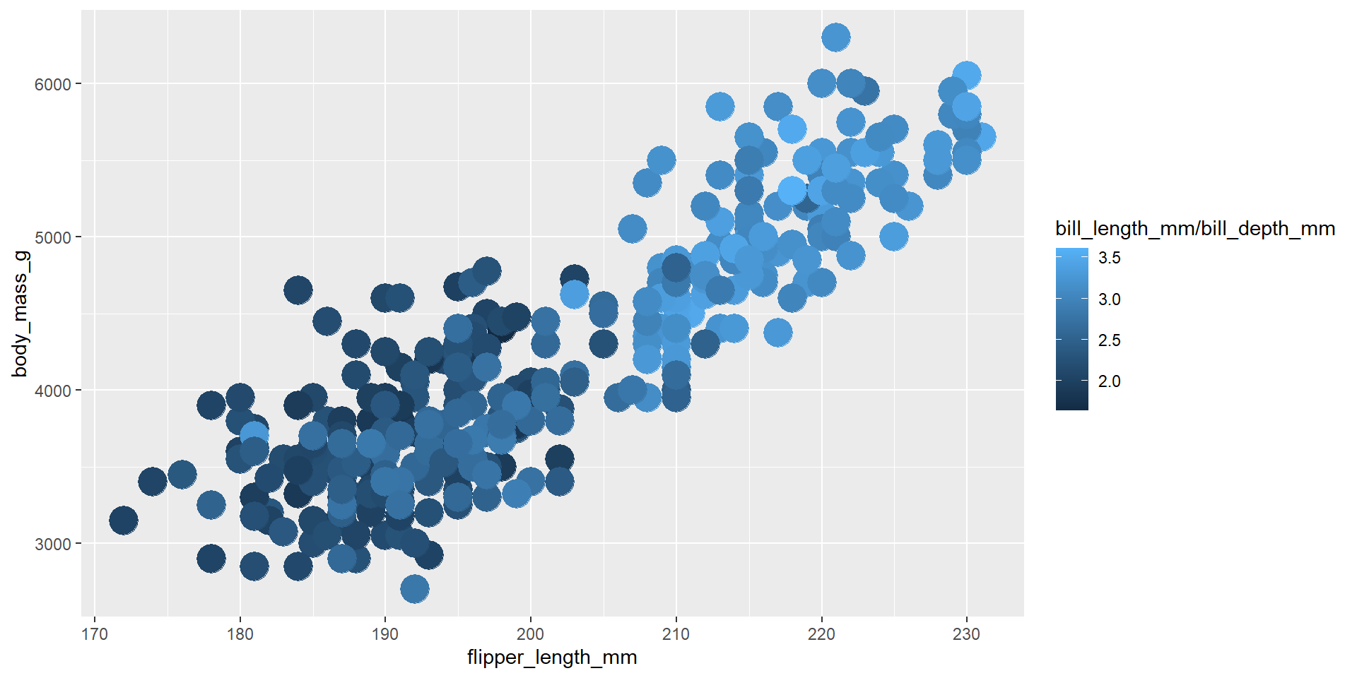
Exercise 7
Draw a scatter plot using the variable flipper_length_mm for the x-axis, and the variable body_mass_g on the y-axis. Use different colours for different values of the new continuous variable obtained from the ratio of bill_length_mm by bill_depth_mm.
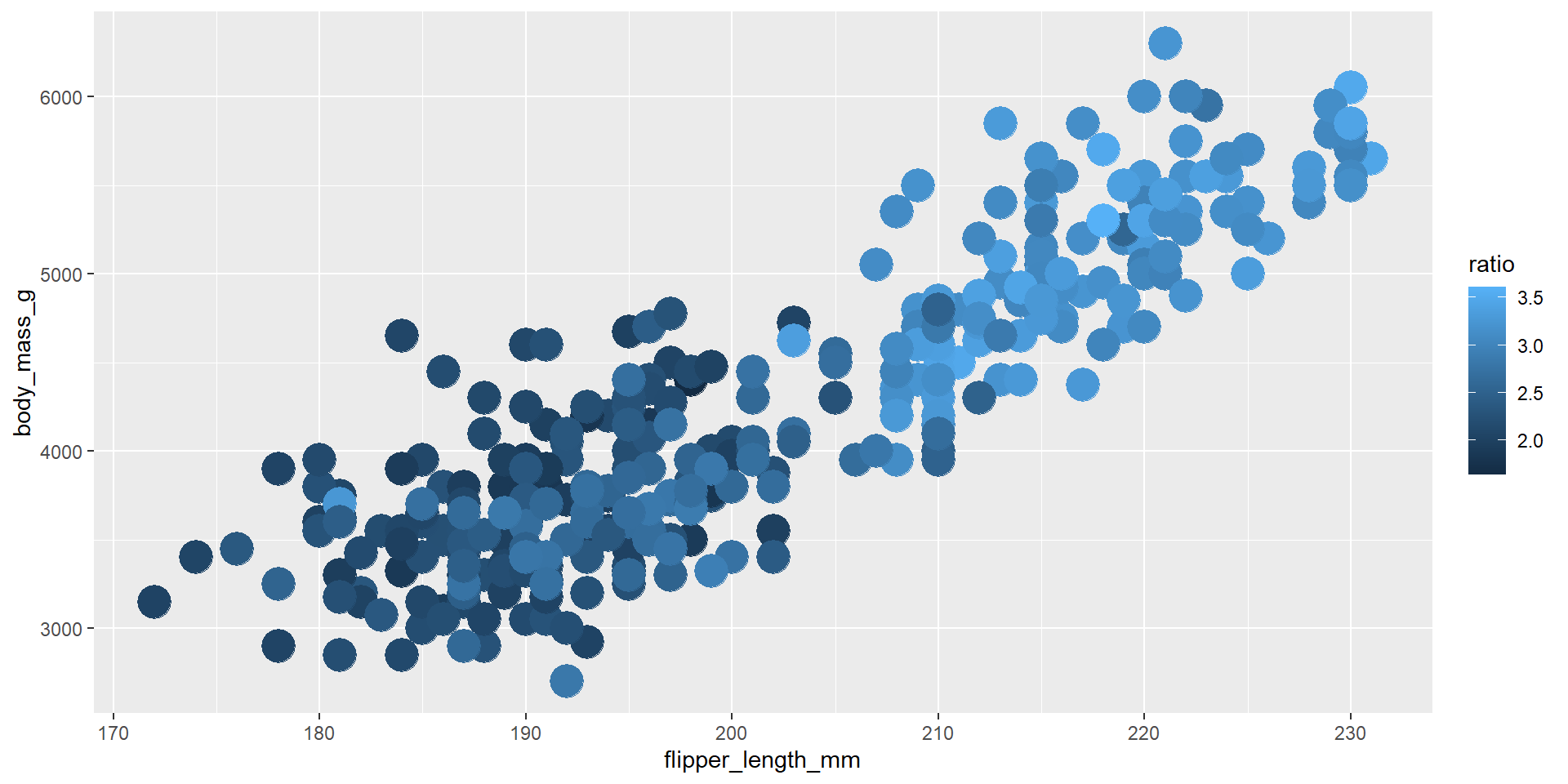
Exercise 8
Repeat the previous exercise using the dplyr verb mutate calling the new variable ratio.
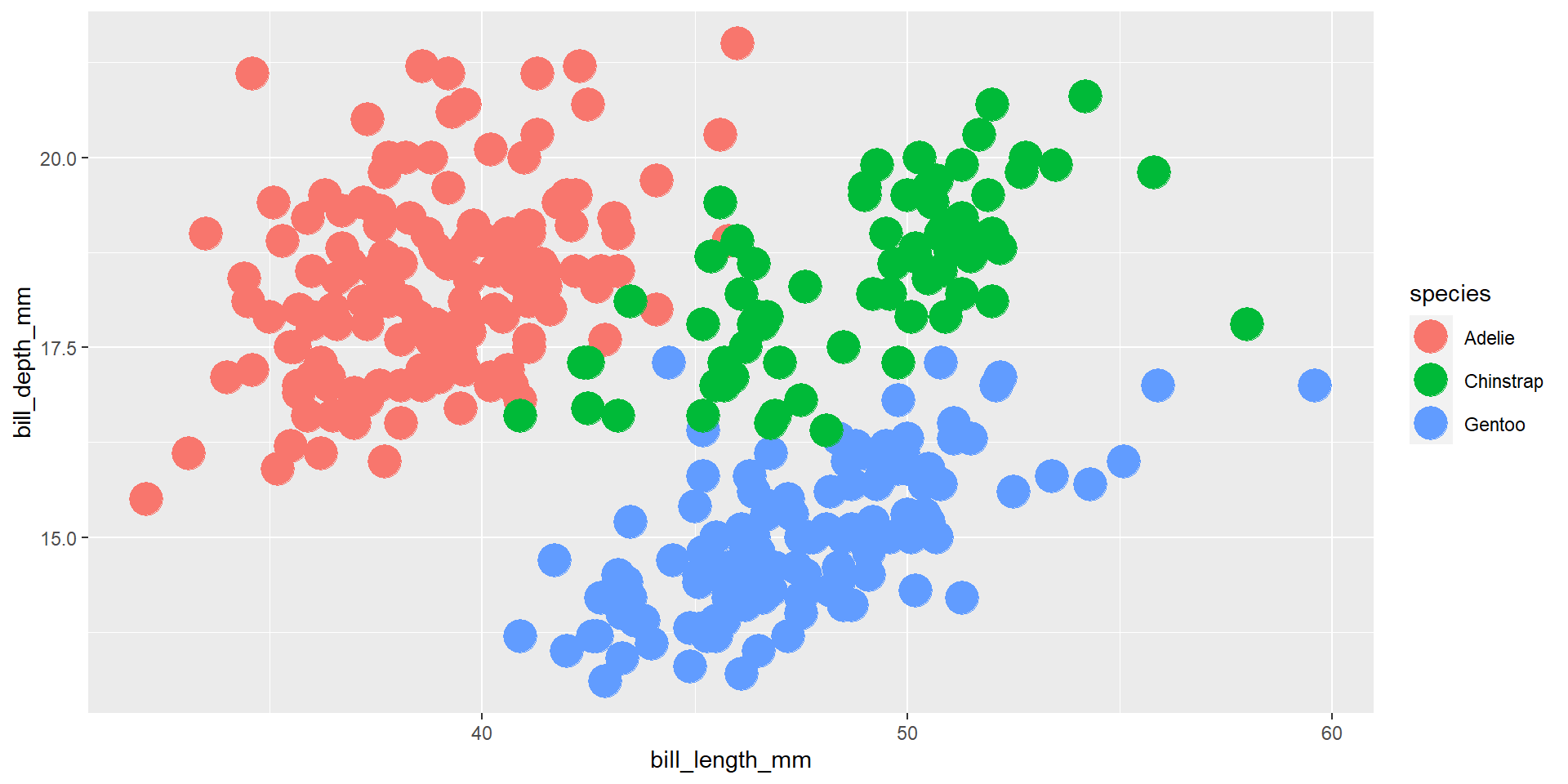
Exercise 9
Draw a scatter plot using the variable bill_length_mm for the x-axis, and the variable bill_depth_mm on the y-axis. Use different colours for different species.
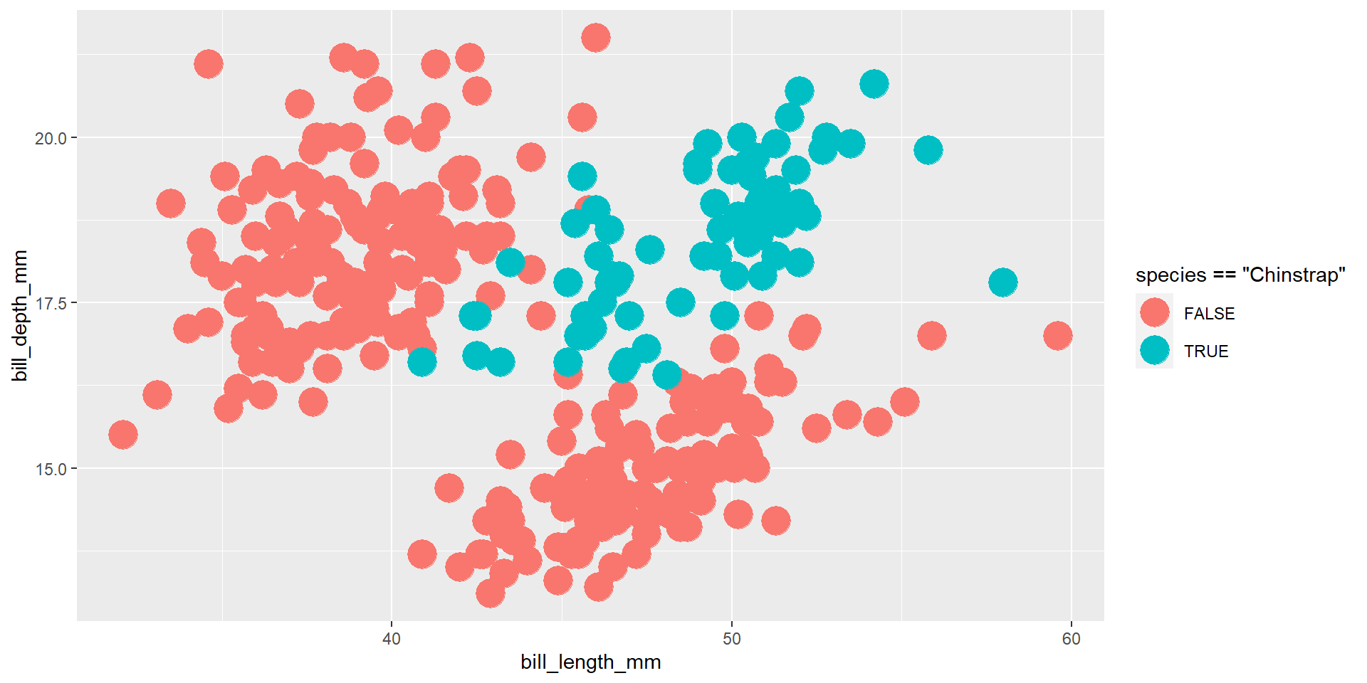
Exercise 10
Draw a scatter plot using the variable bill_length_mm for the x-axis, and the variable bill_depth_mm on the y-axis. Highlight the penguins that belong to the “Chinstrap” species.
Exercise 11
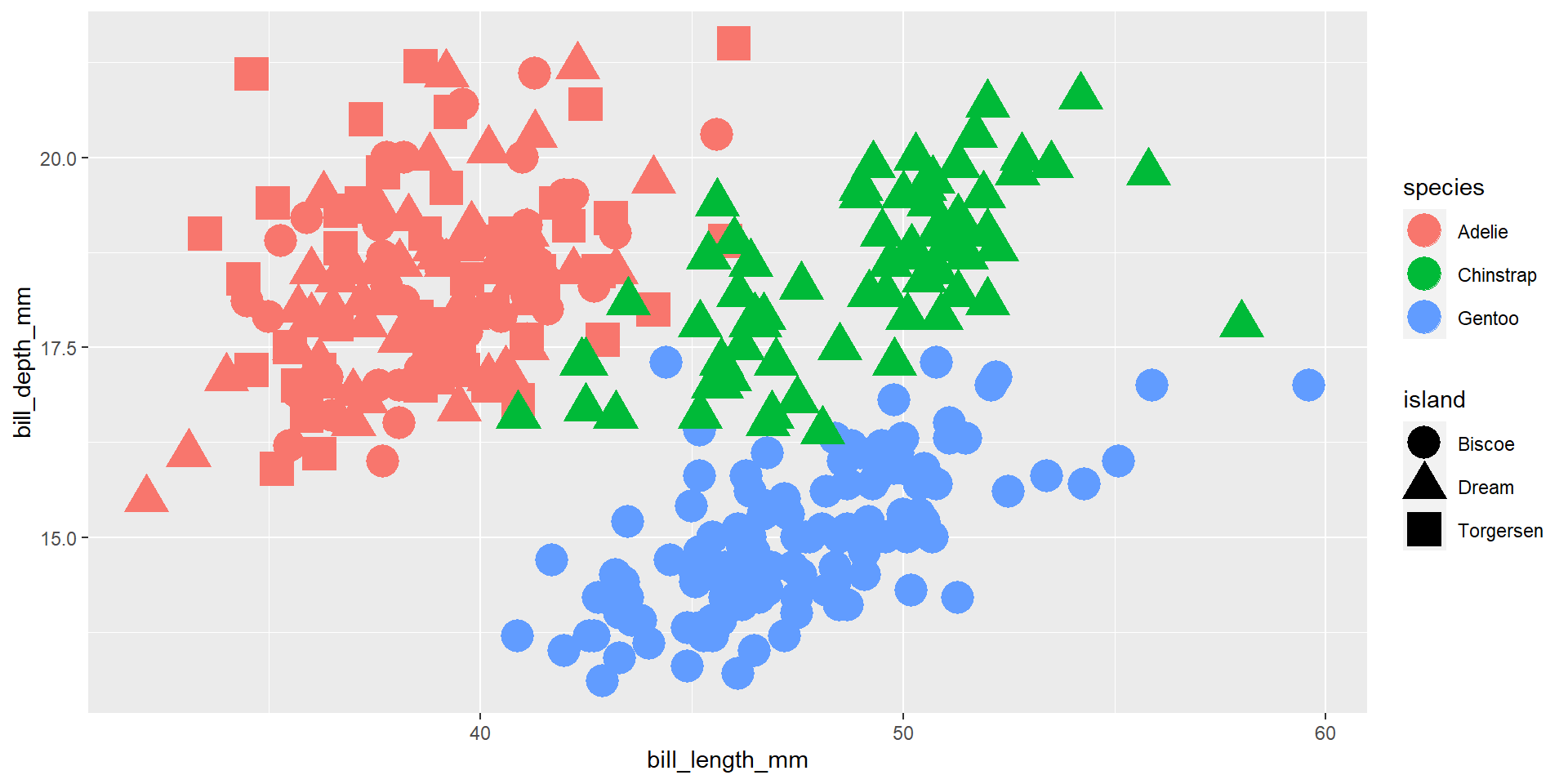
Draw a scatter plot using the variable bill_length_mm for the x-axis, and the variable bill_depth_mm on the y-axis. Use different colours for different species, and different shapes for different islands.
Exercise 12
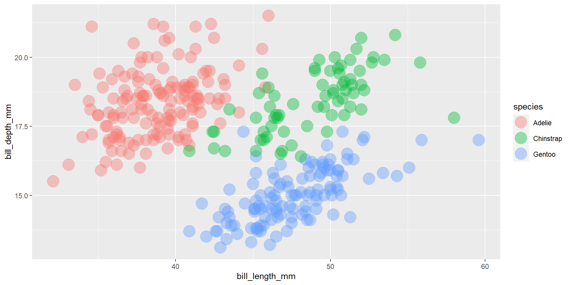
Draw a scatter plot using the variable bill_length_mm for the x-axis, and the variable bill_depth_mm on the y-axis. Use different colours for different species. Change opacity to 0.4.
Exercise 13
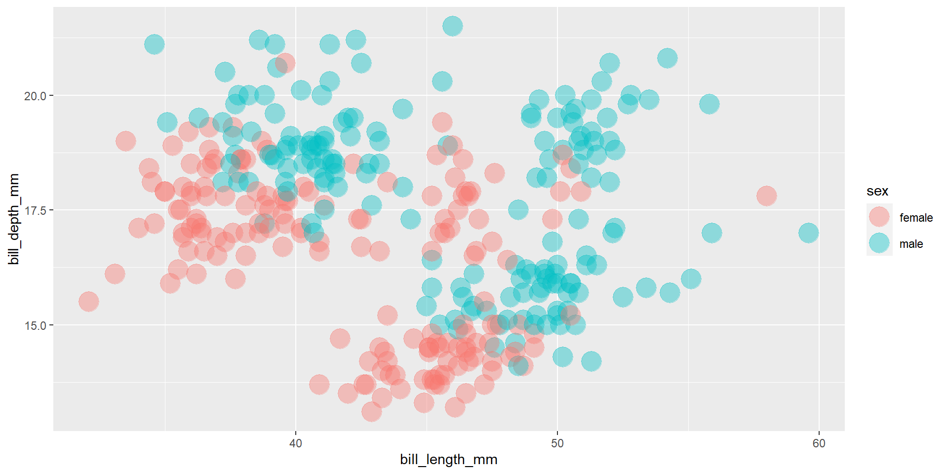
Draw a scatter plot using the variable bill_length_mm for the x-axis, and the variable bill_depth_mm on the y-axis. Use different colours for different penguin sex. Change opacity to 0.4.
Exercise 14
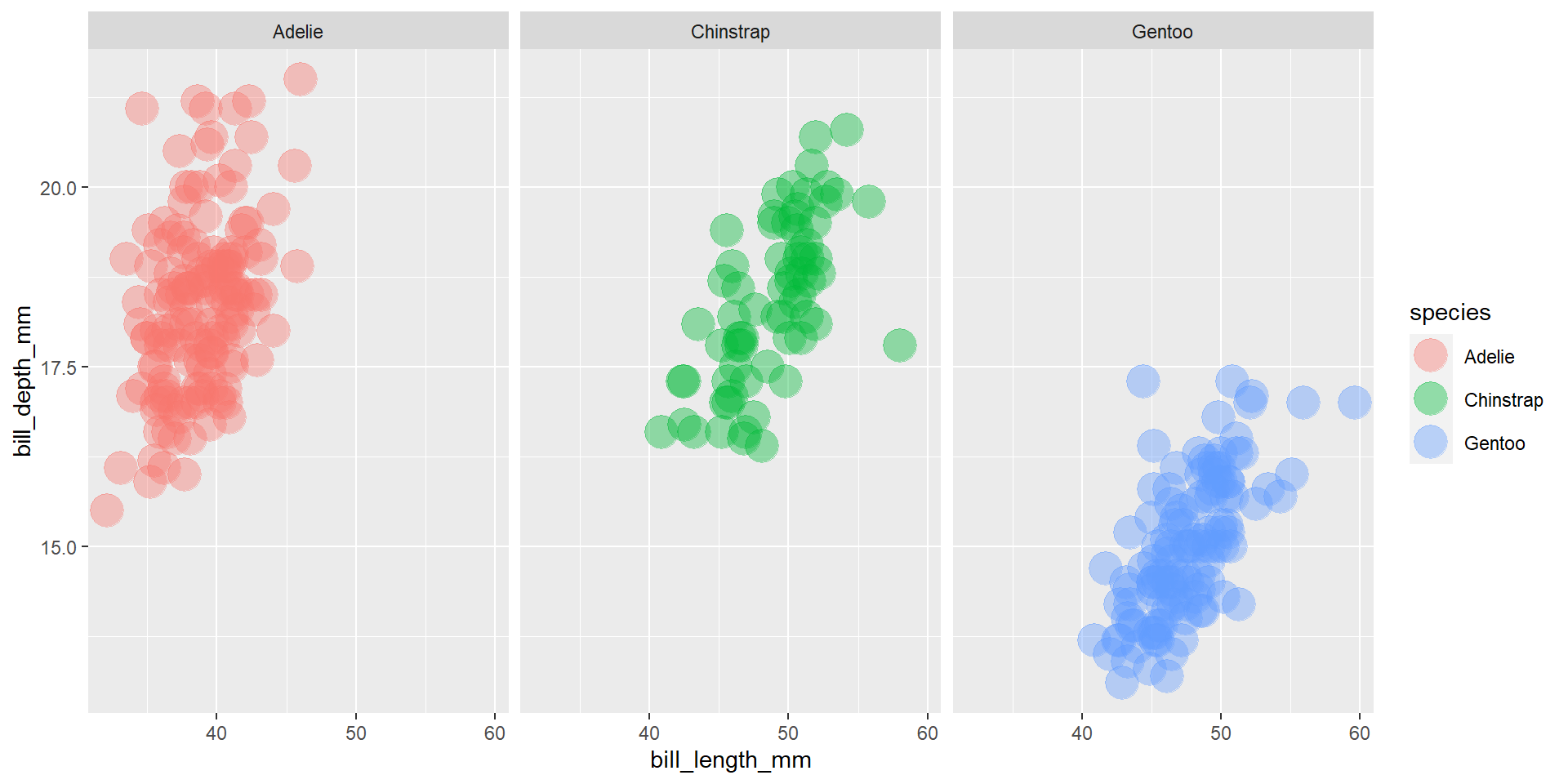
Draw a scatter plot using the variable bill_length_mm for the x-axis, and the variable bill_depth_mm on the y-axis. Use different colours for different penguin species. Change opacity to 0.4. Use different facet (panels) for different species.
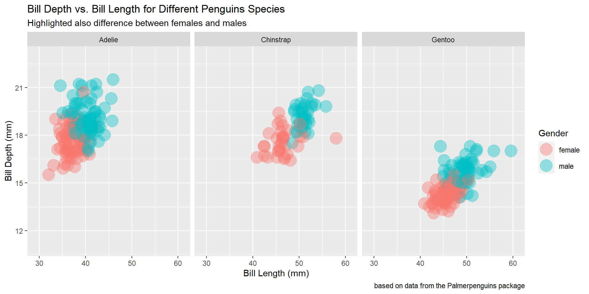
Exercise 15
Draw a scatter plot using the variable bill_length_mm for the x-axis, and the variable bill_depth_mm on the y-axis. Use different colours for different penguin sex. Change opacity to 0.4. Use different facet (panels) for different species.
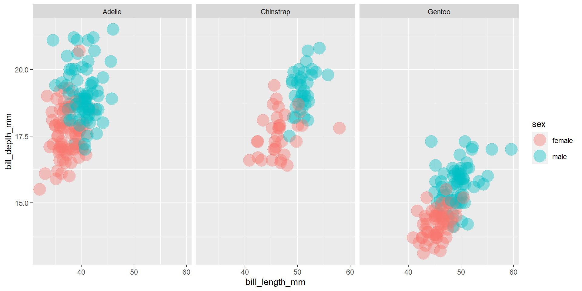
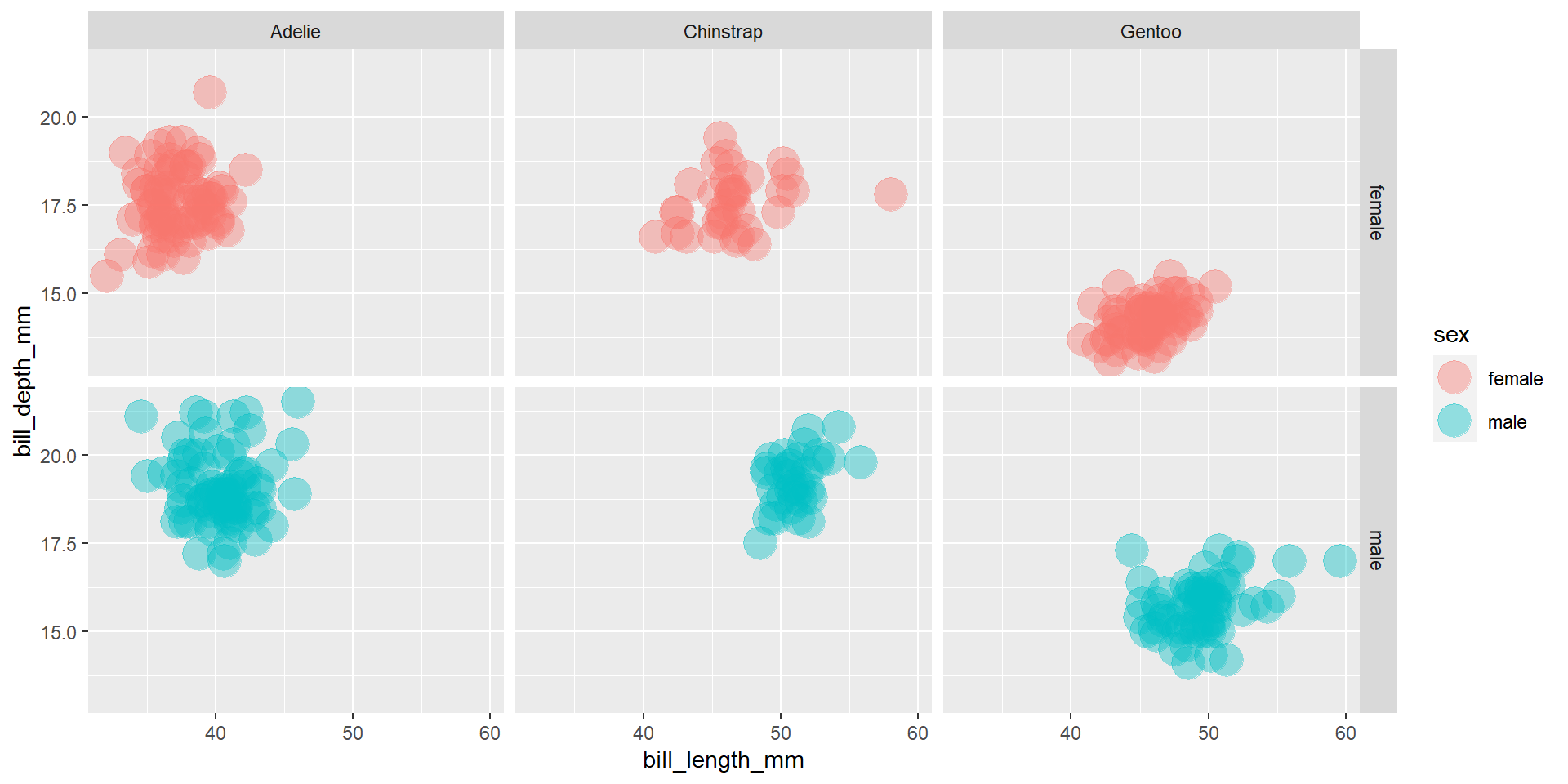
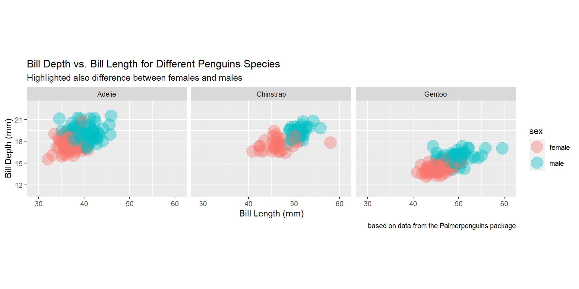
Exercise 17
Draw a scatter plot using the variable bill_length_mm for the x-axis, and the variable bill_depth_mm on the y-axis. Use different colours for different penguin sex. Change opacity to 0.4. Use different facet (panels) for different species and different sex.
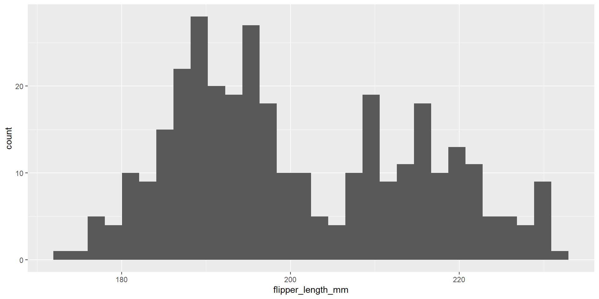
Exercise 18
Draw an histogram with the distribution of the continuous variable flipper_length_mm.
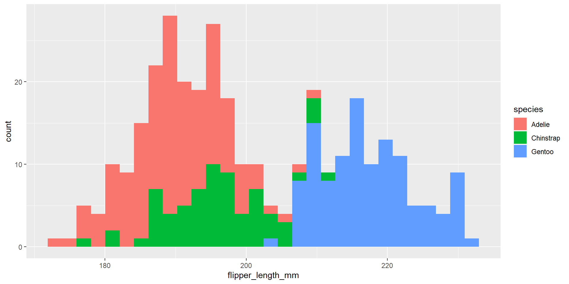
Exercise 19
Draw an histogram with the distribution of the continuous variable flipper_length_mm. Use different colours for different species.
Exercise 20
Draw an histogram with the distribution of the continuous variable flipper_length_mm. Use different colours for different species. Change opacity to 0.4.
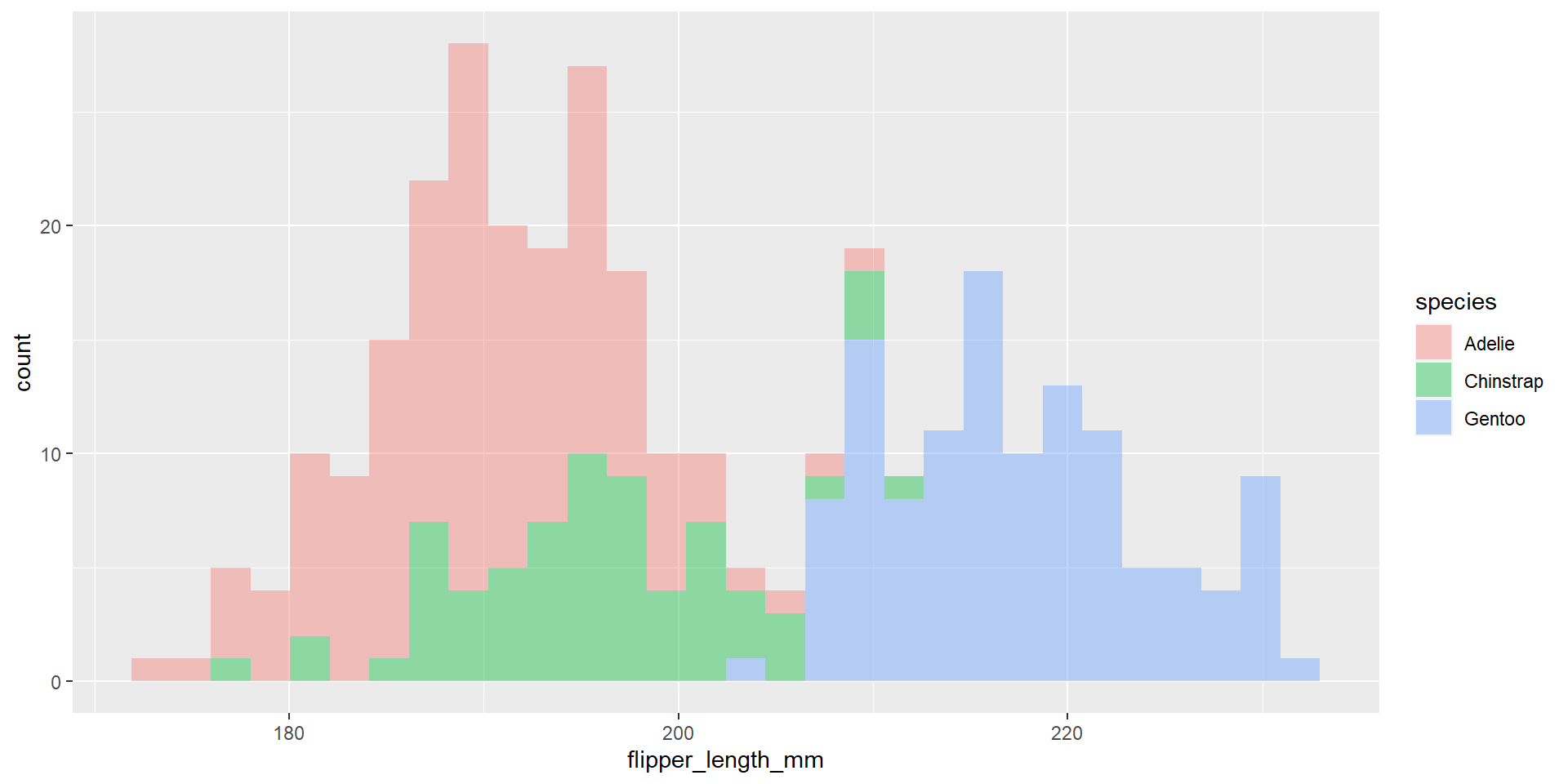
Exercise 21
Draw an histogram with the distribution of the continuous variable flipper_length_mm. Use different colours for different species. Change opacity to 0.4. Use the option position = "stack". What changed compared to the previous exercise?
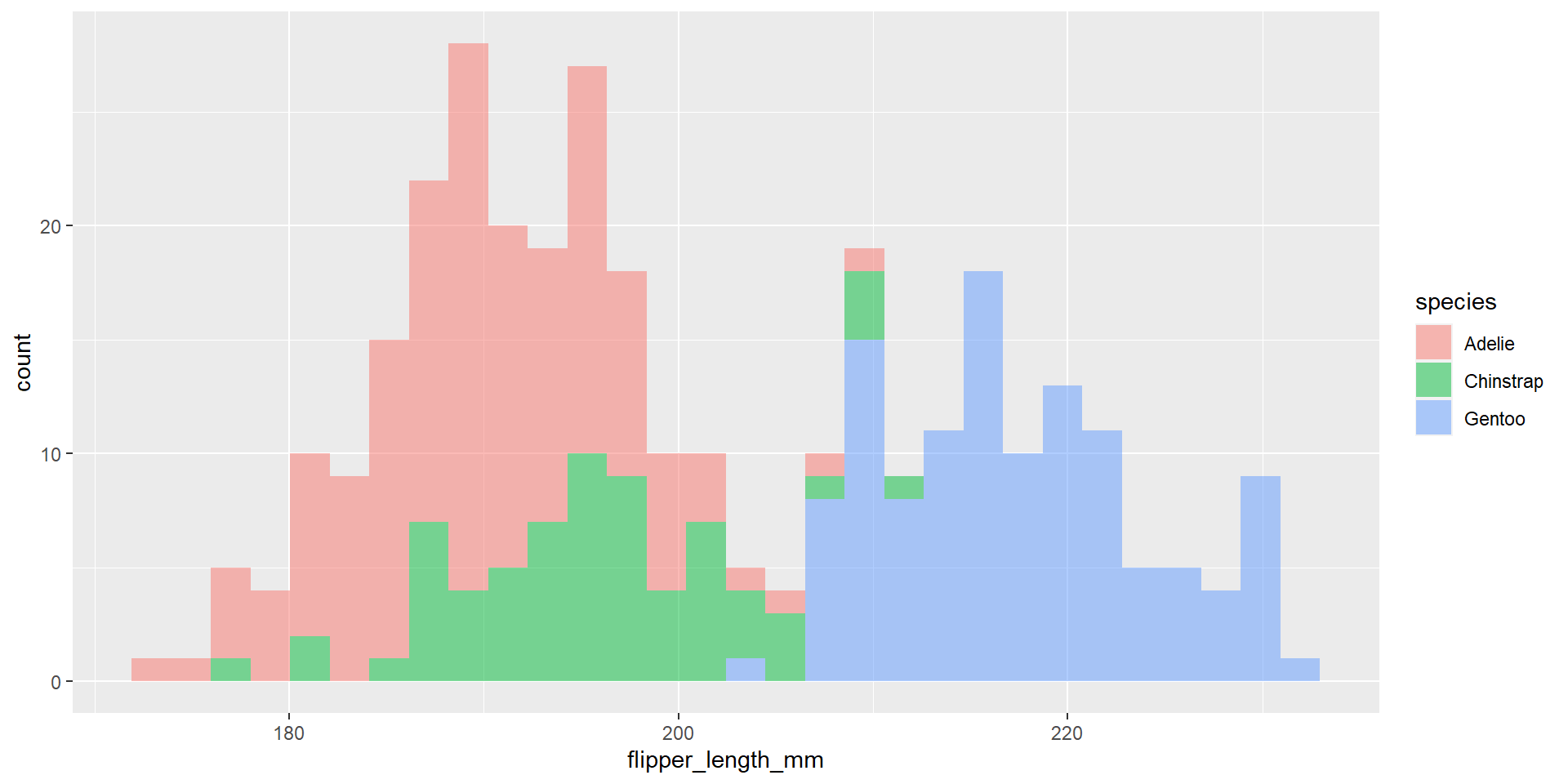
Exercise 22
Draw an histogram with the distribution of the continuous variable flipper_length_mm. Use different colours for different species. Change opacity to 0.4. Use the option position = "identity". What changed compared to the previous exercise?
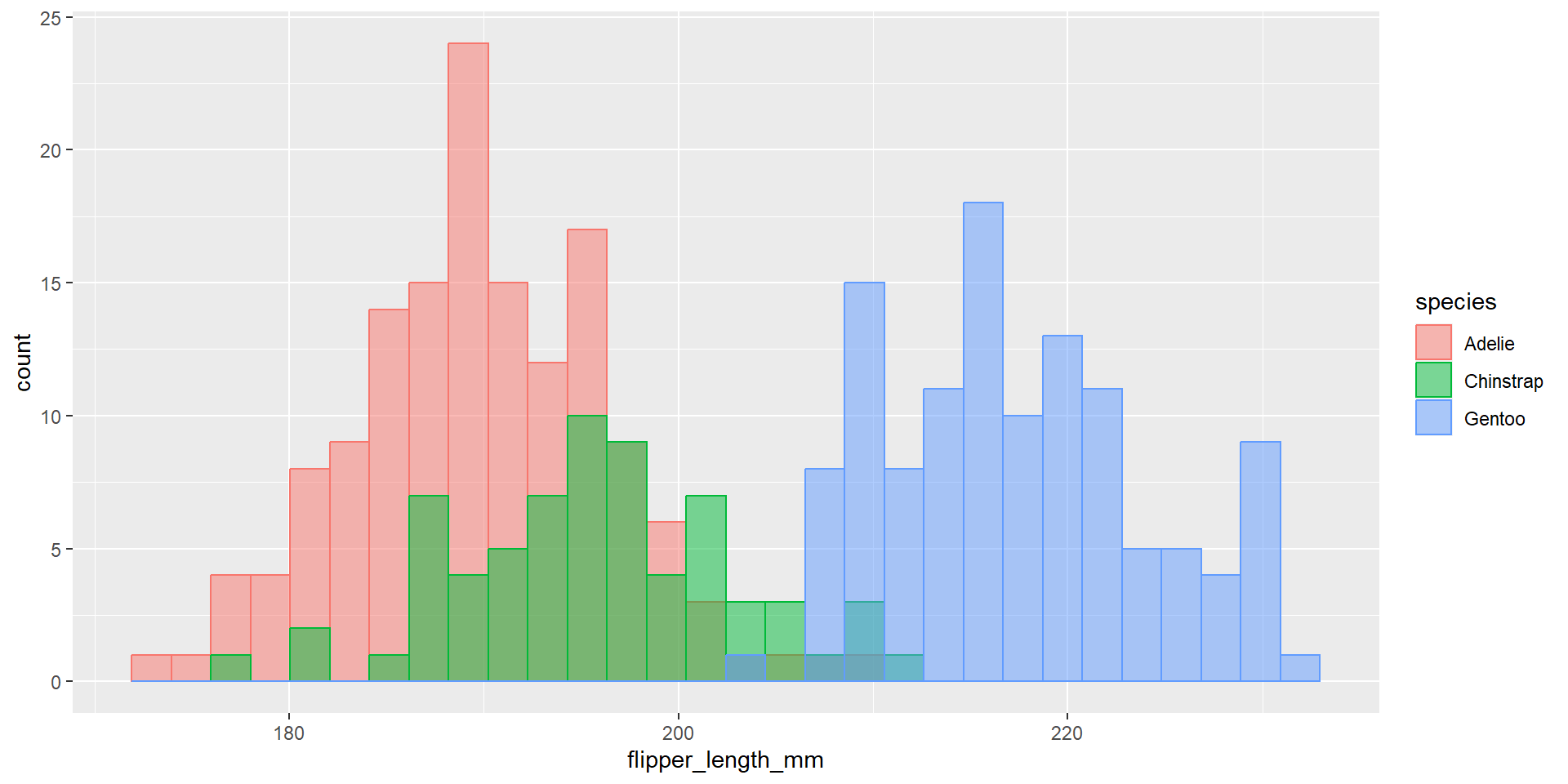
Exercise 23
Draw an histogram with the distribution of the continuous variable flipper_length_mm. Use different colours for different species. Change opacity to 0.4. Use the option position = "identity". This time use also different colour for the borders of the histogram.
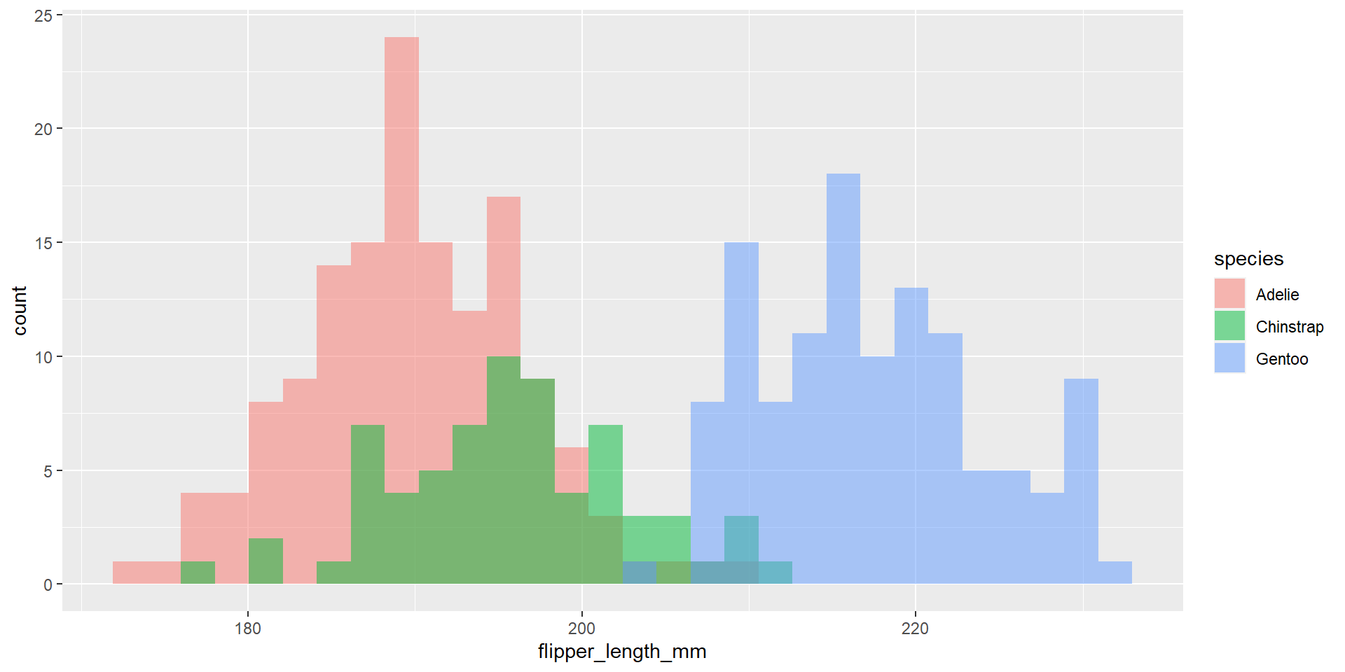
Exercise 24
Draw an histogram with the distribution of the continuous variable flipper_length_mm. Use different colours for different species. Change opacity to 0.4. Use the option position = "dodge". What changed compared to the previous exercise?
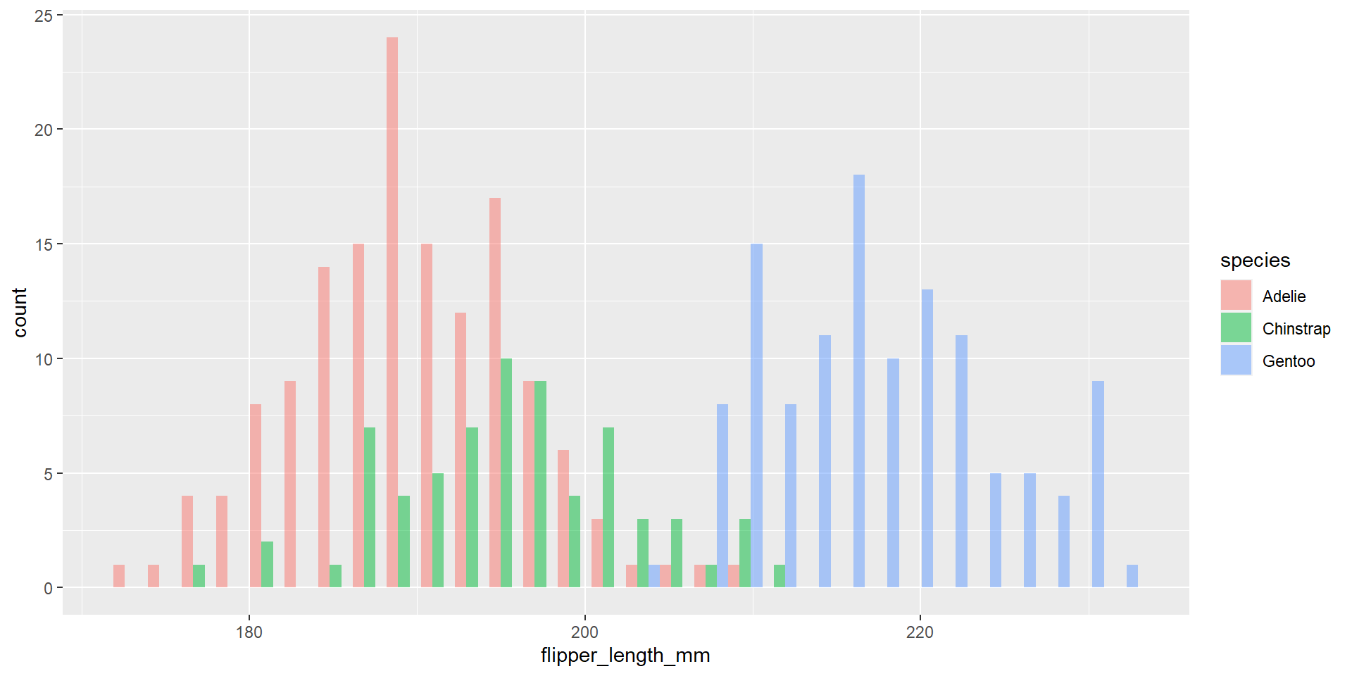
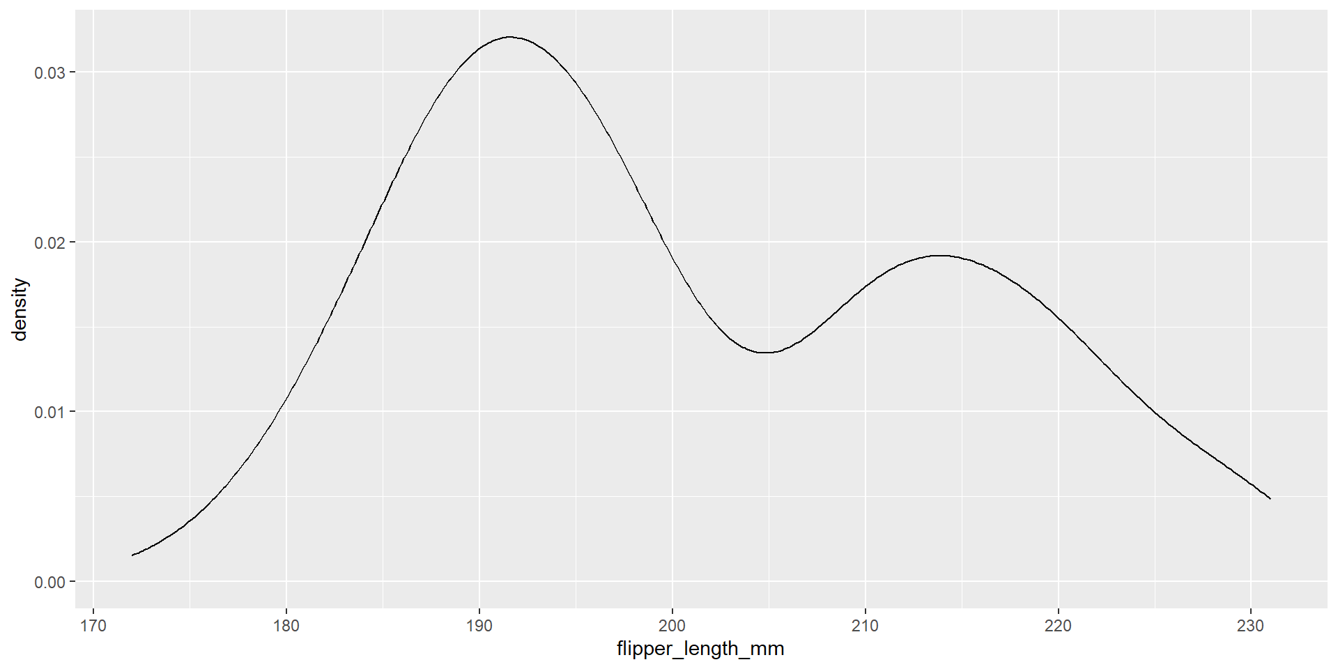
Exercise 25
Draw a density plot with the distribution of the continuous variable flipper_length_mm.
Exercise 26
Draw a density plot with the distribution of the continuous variable flipper_length_mm. Use different colours for different species.
Exercise 27
Draw a density plot with the distribution of the continuous variable flipper_length_mm. Use different colours for different species. Change opacity to 0.6.
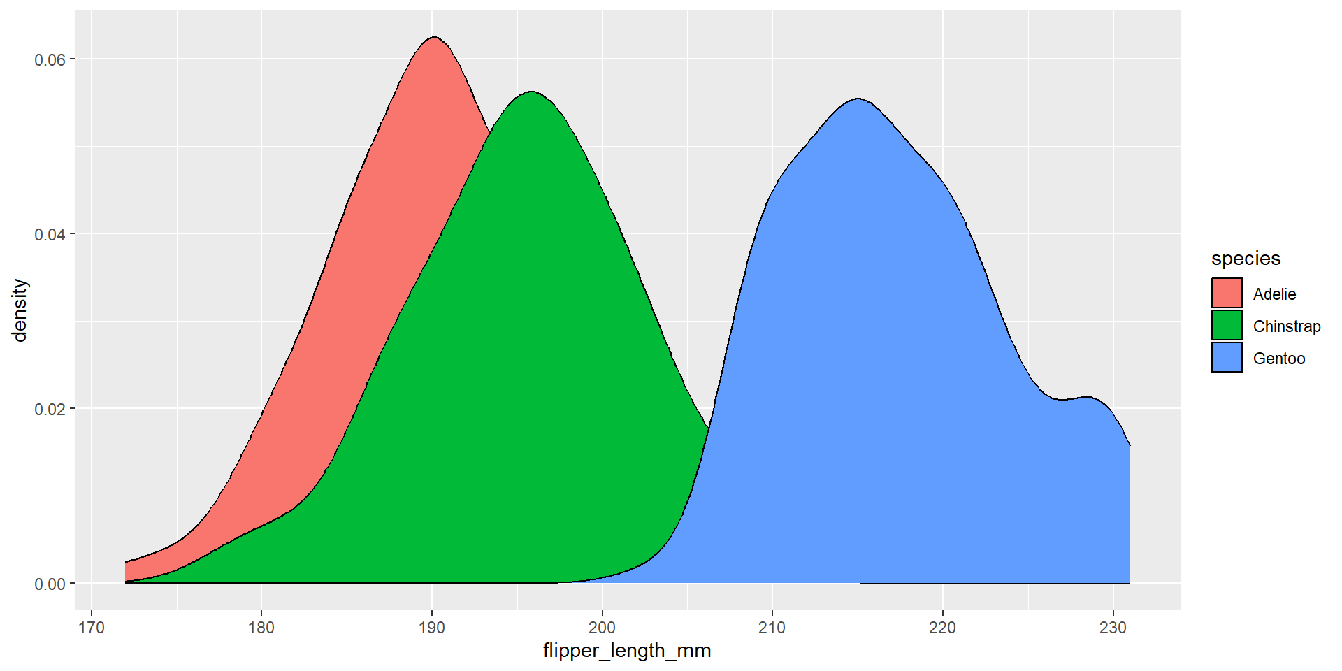
Exercise 28
Draw a density plot with the distribution of the continuous variable flipper_length_mm. Use different colours for different species. Change opacity to 0.6. Change also the colour of the border of the density plot and change its size.
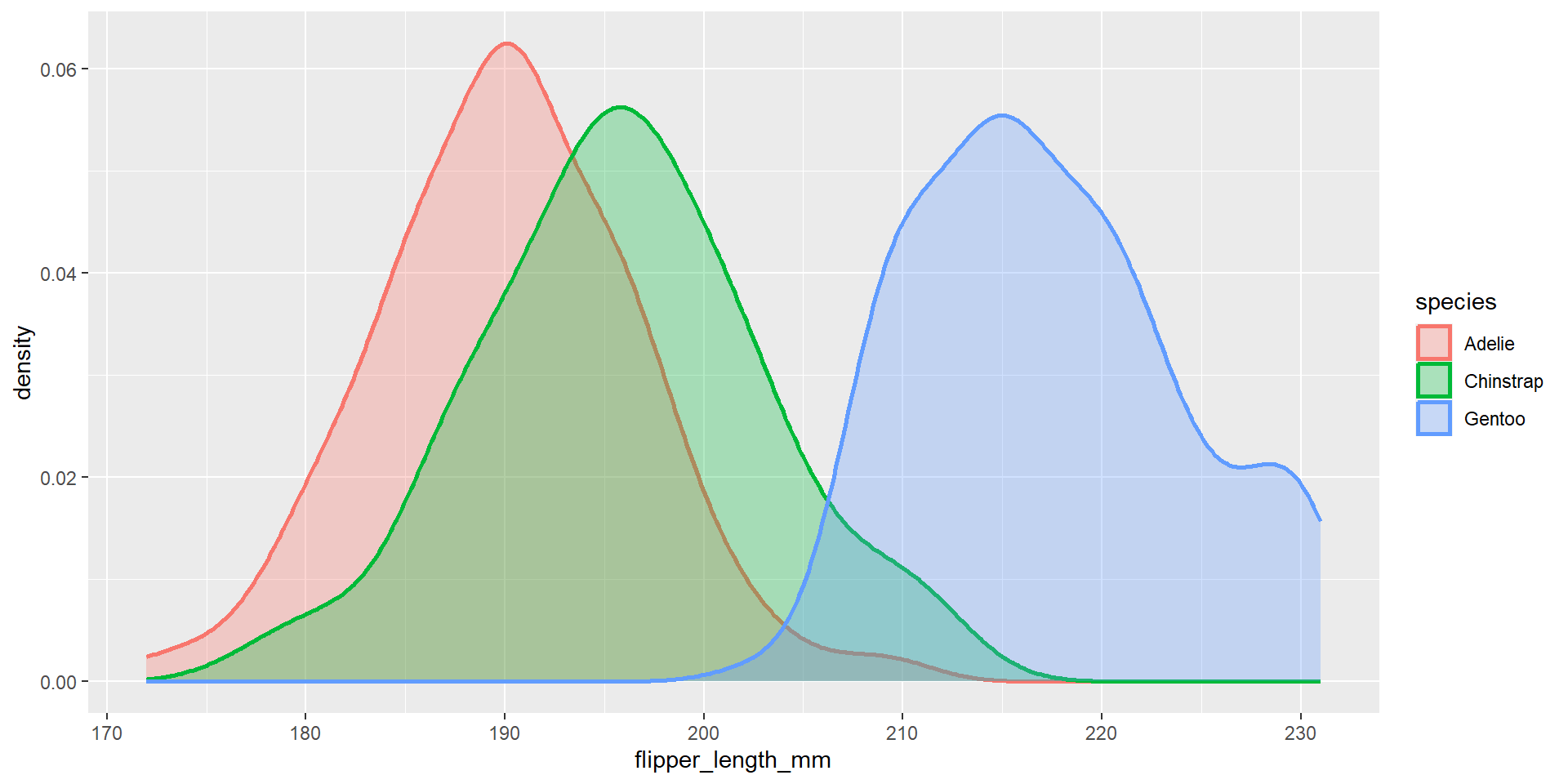
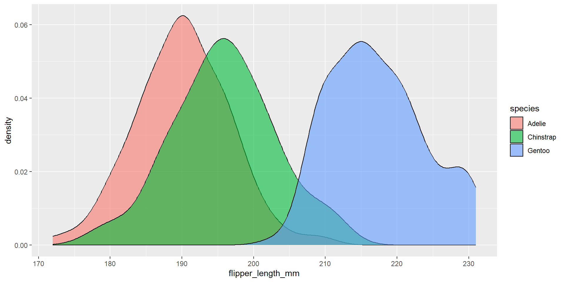
Exercise 29
Reproduce the following plot. Observe the values on the x-axis.

Exercise 30
Repeat the previous exercise using the function seq.

Exercise 31
Repeat the previous exercise also changing the values on the y-axis.

Exercise 32
Reproduce the following plot.
Exercise 33
Change the ratio between x and y axis. Keep the ratio fixed even if you resize the picture.
In the next episode
More Data Visualisation!